- Written by: Hummaid Naseer
- October 27, 2025
- Categories: UI & UX
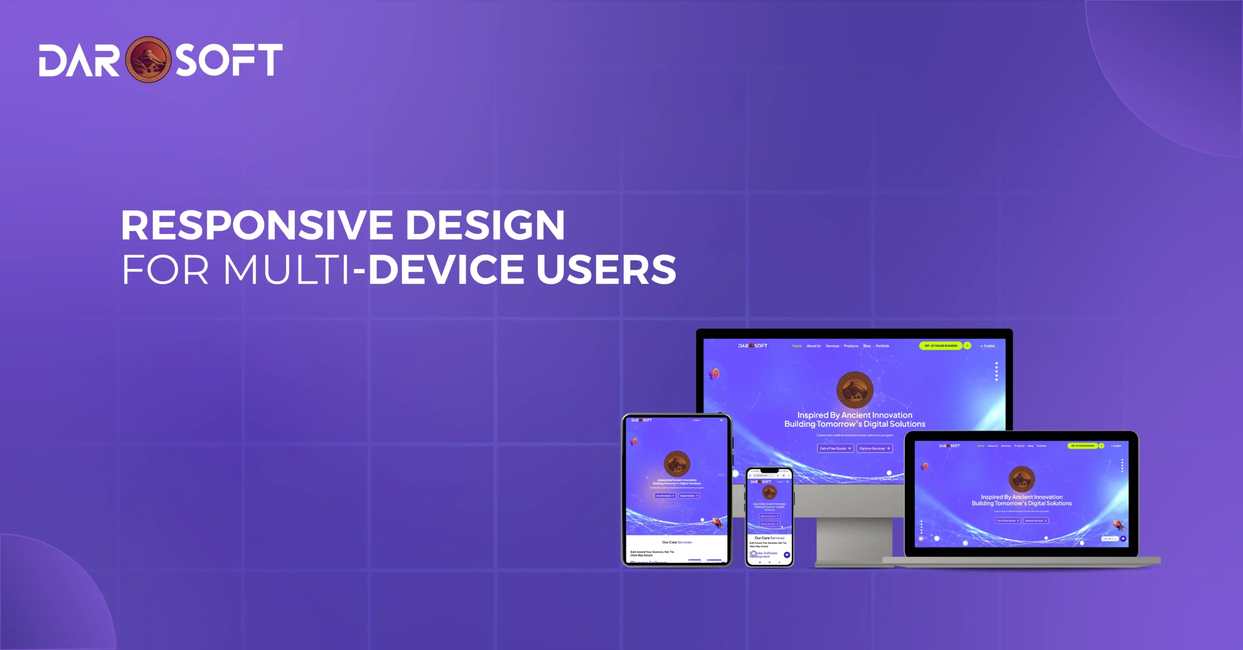
Users move fluidly between smartphones, tablets, laptops, wearables, and even smart TVs. Often within the same journey. They might start browsing a product on their phone during a commute, continue comparing options on a desktop at work, and complete the purchase on a tablet at home.
This shift means that users don’t just expect accessibility across devices. They expect seamless continuity. Any friction, such as inconsistent layouts, missing features, or broken handoffs between devices, can quickly lead to frustration and lost opportunities.
Designing for the multi-device era requires more than responsive layouts. It demands:
Consistency, so users recognize the brand and interface across touchpoints.
Context-awareness, ensuring experiences are optimized for how and where devices are used.
Scalability enables digital products to evolve as new devices and form factors emerge on the market.
Who Are Multi-Device Users?
Today’s users don’t confine themselves to one screen. They weave between devices depending on context, convenience, and their intended use. This behavior has created a new normal: the multi-device user.
From Mobile to Tablet to Desktop (and Back Again)
A single browsing or shopping journey often spans multiple devices:
A user might discover a product on social media via mobile,
Research reviews on a desktop while at work,
And complete the purchase later on a tablet at home.
This constant switching reflects how digital experiences have become integrated into daily routines, on the go, at work, and in leisure time.
The Rise of Cross-Device Journeys
Studies show that most online journeys today involve at least two or more devices. People expect to pick up exactly where they left off, regardless of which screen they’re holding. For brands, this means that disconnected or inconsistent experiences create major drop-off risks.
Multi-device users also demand:
Seamless continuity — cart items, preferences, and progress should carry across devices.
Consistent branding — so they recognize the same tone, visuals, and navigation everywhere.
Optimized experiences per context — fast, touch-friendly on mobile; richer detail and multitasking on desktop.
Why Responsive Design Matters More Than Ever
With users constantly shifting between devices, responsive design has evolved from a “nice-to-have” into a non-negotiable standard. It ensures that no matter the screen size, orientation, or device type, users receive a consistent, seamless experience.
Consistency Across Devices
Responsive design guarantees that your brand looks and feels the same everywhere.
Layouts adapt fluidly from mobile to tablet to desktop without breaking.
Fonts, buttons, and imagery resize proportionally for readability and accessibility.
Navigation stays familiar, so users don’t need to “relearn” the interface on each device.
This consistency builds trust and reduces friction, allowing users to focus on their goals rather than struggling with clunky design shifts.
Meeting User Expectations in Real-Time
Today’s users expect instant access and flawless functionality. If a site looks broken on one device, most won’t give it a second chance.
Responsive design ensures fast-loading, mobile-friendly pages that keep engagement high.
It prevents the frustration of having to pinch, zoom, or scroll awkwardly.
Real-time adaptability also supports new devices and screen sizes as they enter the market.
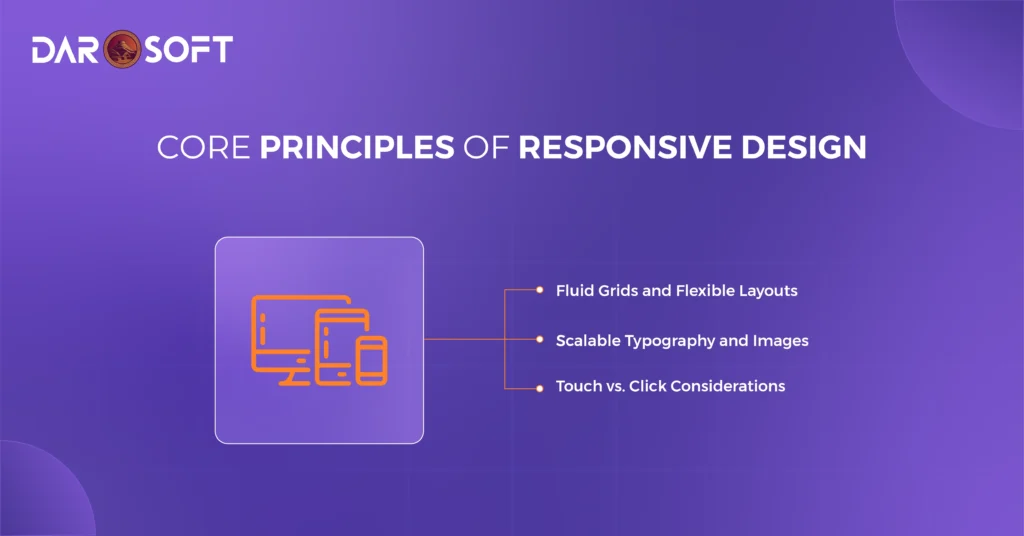
Responsive design is more than resizing content. It’s about ensuring usability, readability, and consistency across every screen. To achieve this, designers and developers rely on a few foundational principles:
Fluid Grids and Flexible Layouts
Traditional fixed-width layouts break on smaller or larger screens. Fluid grids, however, allow elements to scale proportionally.
Use relative units (%, em, rem, vw/vh) instead of fixed pixels.
Apply breakpoints strategically to adjust layouts for different devices.
Ensure that content reflows naturally without overlap or awkward spacing.
Scalable Typography and Images
Readability and visual clarity depend on adaptable text and media.
Implement responsive typography using scalable units like rem and viewport-based sizing.
Use responsive images (srcset, picture elements) to load the right size for the right device, reducing unnecessary bandwidth.
Maintain aspect ratios so images don’t stretch or distort.
Touch vs. Click Considerations
Users interact differently on mobile vs. desktop — touch vs. mouse.
Ensure buttons and links have sufficient size and spacing for fingers (minimum 44px target).
Avoid hover-only effects, since mobile users can’t hover.
Design interactions that feel natural: swiping and tapping on mobile, precise clicking on desktop.
How Responsive Design Improves User Experience
Responsive design isn’t just a technical approach. It’s a UX strategy that removes barriers and makes digital experiences feel natural across devices.
Faster Navigation and Accessibility
Users expect to find what they need quickly, no matter the screen size.
Simplified menus adapt to mobile with collapsible navigation (hamburger menus, bottom tabs).
Readable typography ensures content doesn’t require pinching or zooming.
Accessibility-first design: larger tap targets, high-contrast text, and screen reader support ensure inclusivity for all users.
By making interfaces easy to navigate, responsive design keeps users engaged rather than frustrated.
Reduced Friction in Cross-Device Interactions
Many journeys today start on one device and finish on another. Responsive design smooths these transitions.
Content reflows seamlessly across mobile, tablet, and desktop, so users never feel like they’re starting over.
Consistent design systems reinforce trust and familiarity across devices.
Features like saved carts, synced preferences, and persistent sessions make switching devices effortless.
Business Benefits of Responsive Design
Responsive design isn’t just about aesthetics or usability. It has a measurable effect on business performance. Companies that invest in responsive experiences see improvements across search visibility, customer engagement, and bottom-line results.
Better SEO Rankings
Search engines prioritize mobile-friendly websites.
Google’s mobile-first indexing means your mobile site is the baseline for SEO performance.
Responsive sites consolidate traffic to a single URL (instead of splitting between desktop and mobile versions), improving domain authority.
Faster load times and mobile usability are direct ranking factors that boost visibility.
Increased Conversions and Engagement
When users can browse and shop easily on any device, they’re more likely to convert.
Simplified mobile checkout processes reduce cart abandonment.
Consistent branding across devices builds trust and encourages repeat visits.
Optimized interactions (touch-friendly CTAs, fast-loading content) keep users engaged longer.
Lower Bounce Rates
A site that looks broken or difficult to use on mobile drives users away instantly.
Responsive design keeps layouts clean and legible on every screen size.
Easy navigation reduces frustration, keeping visitors engaged.
A smoother experience increases the likelihood of moving deeper into the customer journey.
The Future of Responsive Design
Responsive design is evolving beyond the traditional trio of mobile, tablet, and desktop. As technology expands, users are engaging with brands across foldables, wearables, smart TVs, and even in-car displays. Designing for this “any-screen” world means going beyond resizing. It’s about adaptability and continuity everywhere.
Designing for Foldables
Foldable devices introduce dual states: compact (like a phone) and expanded (like a tablet).
Ensure layout continuity so content adjusts seamlessly when screens fold or unfold.
Take advantage of larger unfolded screens for richer, multitasking-friendly interfaces.
Avoid “breaking” designs by testing both folded and expanded experiences.
Embracing Smart TVs and Large Displays
Smart TVs and connected displays require navigation designed for distance.
Optimize for 10-foot experiences with larger typography, minimal text, and simple menus.
Consider remote control or voice-based interactions instead of touch or click.
Adapt visual content (images, video) for widescreen clarity.
Designing for Wearables
Wearables like smartwatches demand extreme minimalism.
Prioritize micro-interactions such as notifications, quick replies, or health updates.
Use strong icons, concise text, and haptics for clarity.
Design for glances rather than extended engagement.
Preparing for an “Any-Screen” World
The future of responsive design lies in flexibility:
Create design systems that adapt fluidly across all devices.
Think beyond pixels, designing for context, input methods (voice, gestures, touch), and user environments.
Adopt a mindset where no screen is primary, but all screens are part of a continuous journey.
Responsive Design as a Non-Negotiable
In today’s digital landscape, responsive design is no longer a competitive edge. It’s a baseline expectation. Users demand seamless experiences whether they’re browsing on a phone, shopping on a tablet, working on a laptop, or streaming on a smart TV.
A responsive approach ensures:
Consistency across devices, so users trust and recognize your brand anywhere.
Accessibility and performance, making interactions fast, intuitive, and inclusive.
Future readiness, preparing your digital presence for new form factors like foldables, wearables, and beyond.
Without responsiveness, businesses risk higher bounce rates, lower conversions, and weaker brand credibility. With it, they gain stronger engagement, improved SEO, and the flexibility to meet users wherever they are.