- Written by: Hummaid Naseer
- September 12, 2025
- Categories: Services & Products
The days of static, one-size-fits-all websites are behind us. Users expect more than just information; they expect experiences that feel tailored to them. This is where AI-powered personalisation comes in. Instead of showing the same layout, content, or product catalog to everyone, modern websites now adapt in real time, learning from user behavior and responding instantly.
This shift transforms websites from passive platforms into active digital assistants. For businesses, the impact is huge: higher engagement, stronger customer relationships, and a measurable boost in conversions.
Designer’s Perspective: Imagine building websites that don’t just talk at users, but listen and adapt to their needs. That’s the future of web design.
Minimalism 2.0: Clean, Bold, and Purpose-Driven
Minimalism has been a staple in web design for years, but by 2025, it has evolved into something much more intentional. Instead of simply filling websites with white space and stripped-down elements, Minimalism 2.0 is about combining simplicity with purpose, personality, and impact.
Where the older version of minimalism sometimes felt “empty” or even too generic, the new approach ensures every design choice serves a business or user goal. It’s not just about looking sleek; it’s about building clarity, confidence, and trust.
What Makes Minimalism 2.0 Different?
Bold Typography: Instead of using small, neutral fonts, designers are experimenting with oversized, attention-grabbing typefaces to create visual hierarchy and set the tone.
Strategic Use of Colour: A splash of vibrant colour against a clean background can guide user attention and highlight calls-to-action.
Functional Layouts: Every section of the site is structured to guide the visitor smoothly, whether it’s navigating a product catalog or filling out a form.
Microinteractions: Subtle animations and hover effects keep designs engaging without cluttering the interface.
Why Businesses Should Care
Minimalism 2.0 isn’t just a design trend. It’s a business strategy. Studies show that cluttered websites increase bounce rates, while clean, purpose-driven layouts improve user focus and conversion rates. For businesses, this means:
More Trust: Clean interfaces communicate professionalism and credibility.
Faster Decisions: Clear CTAs (call-to-actions) help customers act without second-guessing.
Mobile Friendliness: Minimalist designs naturally adapt better to smaller screens, which is critical as mobile traffic continues to dominate.
Dark Mode as the Default in 2025
Once considered a design “option,” dark mode has become the default choice for many modern websites. From tech startups to creative portfolios, it’s now a design standard that balances user comfort, aesthetics, and performance.
Why Dark Mode Is Taking Over
User Comfort: Reduces glare and eye strain during long browsing sessions.
Modern Look: Sleek, professional, and futuristic, users associate it with cutting-edge brands.
Battery Efficiency: Saves energy on OLED/AMOLED devices, extending mobile usage.
Content Highlighting: Visuals, typography, and colours stand out more vibrantly.
Business Benefits of Dark Mode
Brand Differentiation – Makes your digital presence feel premium and innovative.
Increased Engagement – Comfortable viewing keeps users on your site longer.
Creative Freedom – Dark backgrounds allow bold typography and striking colour accents.
Best Practices for Designing in Dark Mode
Maintain high contrast for readability (light text, muted accents).
Use accessible colour palettes — avoid neon or overly bright tones.
Provide a light mode option for user preference and accessibility.
Where Dark Mode Shines the Most
Tech & SaaS Platforms – Developers and digital professionals love darker interfaces.
Gaming Websites – Complement immersive, high-contrast visuals.
Creative Portfolios – Dark backdrops showcase designs and photography like a gallery.
Immersive 3D & Micro-Interactions
Web design is no longer about static visuals. It’s about creating experiences that feel alive. Subtle animations, 3D product previews, and micro-interactions are redefining how users engage with websites. Done right, these elements turn browsing into an interactive journey rather than just scrolling through pages.
Why 3D & Micro-Interactions Matter
Deeper Engagement: Users stay longer when the interface feels dynamic and responsive.
Better Understanding: 3D product views let customers inspect items as if they were in-store.
Emotional Connection: Micro-interactions (like a heart icon pulsing when clicked) create delight and build trust.
Memorability: Interactive sites stand out from competitors and leave lasting impressions.
Business Benefits
Higher Conversion Rates – Interactive product demos reduce hesitation in buying decisions.
Brand Storytelling – Animations and 3D bring abstract concepts to life.
Enhanced Usability – Micro-interactions guide users subtly (e.g., button hover effects indicating action).
Best Practices for Designers
Keep animations subtle — too much movement can feel distracting.
Optimise for performance — heavy 3D elements should not slow loading times.
Ensure accessibility — provide fallbacks for devices/browsers that don’t support advanced features.
Always test across devices — what looks smooth on desktop may lag on mobile.
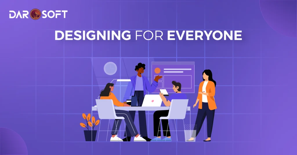
Designing for Everyone
The best websites are designed with all users in mind, including those with visual, auditory, cognitive, or motor impairments. This isn’t just about compliance with regulations; it’s about creating digital experiences that are truly inclusive.
When businesses prioritise accessibility, they don’t just expand their audience, they also improve usability for every visitor.
Why Accessibility Matters
Inclusivity: Ensures people with disabilities can fully engage with your site.
Wider Reach: Millions of potential customers rely on accessible design features.
Legal Protection: Many regions enforce accessibility standards (like WCAG or ADA compliance).
Better UX for Everyone: Features like voice navigation or readable fonts also help mobile users, seniors, and those in low-light environments.
Core Accessibility Practices
Readable Fonts & Proper Contrast – High contrast between text and background improves readability.
Alt Text for Images – Makes visuals accessible to screen readers.
Keyboard Navigation – Ensures users can browse without a mouse.
Voice Commands & ARIA Labels – Assists those relying on assistive technology.
Responsive Layouts – Ensures accessibility across devices and screen sizes.
Business Benefits of Accessible Design
Improved SEO – Search engines favour well-structured, accessible websites.
Increased Conversions – A smoother experience means fewer drop-offs.
Positive Brand Image – Inclusivity reflects social responsibility.
Future-Proofing – Accessibility ensures long-term usability as technology evolves.
Best Practices for Designers
Design with colour-blind safe palettes.
Use clear, simple navigation structures.
Provide captions/transcripts for video and audio content.
Test websites with screen readers and accessibility checkers.
Mobile-First and Beyond
For years, mobile-first design has been the golden rule. The digital landscape is expanding far beyond smartphones and tablets. With the rise of smartwatches, AR glasses, and other connected devices, web design is entering a new frontier — one where user experiences must adapt to entirely new form factors.
Forward-thinking businesses are already preparing for this shift, ensuring their websites and digital products don’t just look good on a phone, but also function seamlessly on emerging devices.
From Mobile-First to Multi-Device Experiences
Smartwatches: Bite-sized content and notifications designed for glances.
AR Glasses: Immersive overlays for shopping, navigation, or training.
IoT Devices: Interfaces that prioritise voice and touch-free interactions.
This means designers must think beyond responsiveness and consider context — how, where, and why a user interacts with content.
Key Design Considerations
Micro-Content for Wearables – Prioritise essentials like notifications, navigation, or key stats.
Gesture & Voice Controls – Move beyond clicks to natural interactions.
AR-Friendly Interfaces – Use 3D models, spatial design, and overlays that enhance reality without overwhelming it.
Performance Optimisation – Lightweight designs are crucial for devices with limited processing power.
Context-Aware UX – Anticipate user needs based on location, activity, or device type.
Why This Matters for Businesses
Early Adoption Advantage – Being AR- and wearable-ready differentiates you from competitors.
New Revenue Streams – Interactive shopping, training, and service experiences.
Future-Proofing – Ensures your digital presence evolves with technology.
Better Engagement – Meeting users where they are — on their wrist, in their glasses, or beyond.
Creating Eco-Friendly Digital Experiences
Every website, app, or platform we create consumes energy, from servers powering data centers to the devices users browse on. This has led to the rise of green web design, a practice that optimises websites to be faster, lighter, and more resource-efficient, reducing their digital carbon footprint.
But this isn’t just about helping the planet. Sustainable design also improves user experience, SEO, and overall performance, making it a win-win for businesses and audiences alike.
Why Sustainable Design Matters
Energy Efficiency – Websites that load faster consume less power.
Reduced Carbon Footprint – Lower bandwidth and server demand = fewer emissions.
Improved SEO – Google rewards lightweight, optimised websites with higher rankings.
Better User Experience – Faster loading times reduce bounce rates and increase engagement.
Best Practices for Green Web Design
Lightweight Code – Avoid bloated scripts; use clean, efficient code.
Optimised Media – Compress images and videos without sacrificing quality.
Efficient Hosting – Choose eco-friendly web hosts powered by renewable energy.
Caching & CDNs – Reduce server strain and deliver content faster.
Minimalist Design – Less clutter means less data to load, and more focus for users.
Dark Mode Options – Helps reduce energy use on OLED screens.
The Business Advantage of Sustainable Websites
Faster Sites, Happier Users – Speed = conversions.
Brand Reputation – Show customers you care about the planet.
Lower Costs – Less bandwidth and server usage mean reduced expenses.
Future-Proofing – Staying aligned with upcoming sustainability regulations and user expectations.
Storytelling as the Heart of Web Experiences
For years, many websites were built the same way: designers created layouts first, and only later did the content team “fit” words, images, and media into those boxes. In 2025, this approach is shifting. Content is now leading the design process.
Websites are no longer just digital brochures. They’re storytelling platforms. Businesses are realising that their narrative, voice, and value proposition matter more than flashy visuals alone. As a result, design decisions now revolve around the story, with typography, colours, and layouts serving as tools to emphasise the message.
Why Content-Led Design Matters
Authentic Storytelling – Users connect more deeply with clear, narrative-driven content.
Stronger Brand Identity – The design highlights the brand’s personality and values.
Improved Engagement – A well-told story keeps users scrolling, clicking, and exploring.
Better Conversions – When the design emphasises the right calls-to-action, visitors know exactly what to do next.
Best Practices for Content-Led Design
Start with the Story – Define the brand message before any wireframes are created.
Design for Readability – Use typography and spacing that make content easy to digest.
Use Visual Hierarchy – Place content in a way that naturally guides the reader’s eye.
Integrate Media Thoughtfully – Images, videos, and animations should support, not distract from, the message.
Focus on Clarity Over Clutter – Every element should amplify the story, not compete with it.
The Business Advantage of Content-First Design
Stronger Emotional Connection – Brands that tell stories build loyalty and trust.
SEO Benefits – Quality, relevant content paired with smart design ranks higher on search engines.
Conversion-Driven Journeys – Visitors are guided seamlessly from information to action.
Consistency Across Channels – Story-first design ensures alignment with marketing, sales, and social campaigns.
Designing for the Future
At Darosoft, we believe your digital presence should be more than just modern. It should be functional, inclusive, and adaptive. Our website creation and digital marketing services go beyond aesthetics, positioning design and strategy as powerful tools to improve user experiences, build trust, and accelerate growth.
The future belongs to businesses that:
Put customers first with accessible and personalised digital experiences.
Harness AI, interactivity, and multi-device adaptability to stay ahead.
Embrace sustainable, high-performing design that’s efficient, fast, and eco-conscious.
As your trusted partner, Darosoft helps you create websites and campaigns that don’t just exist online but listen, adapt, and inspire, turning your digital presence into meaningful connections and measurable success.