- Written by: Hummaid Naseer
- September 2, 2025
- Categories: Services & Products
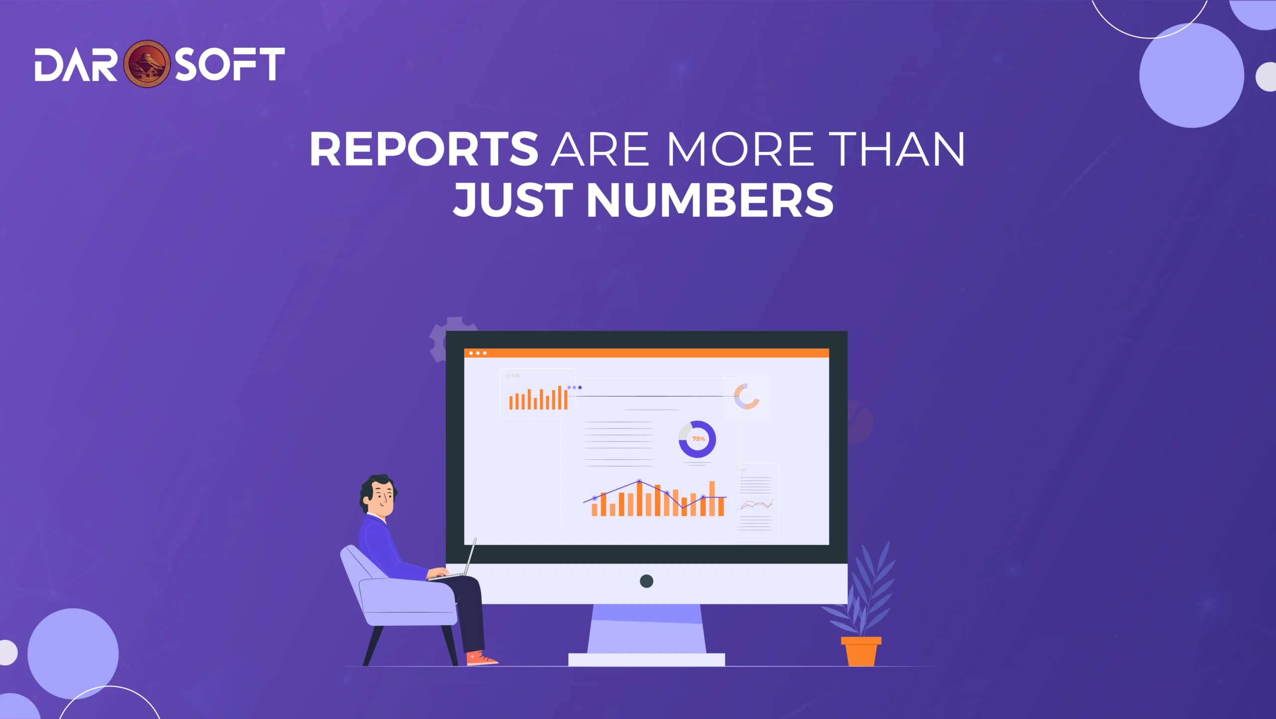
Every system, CRM, ERP, marketing platform, and warehouse tool can generate a report. But here’s the problem: most of those reports are just data dumps, lists of figures, metrics, and timestamps with little context, no interpretation, and zero direction.
Executives and teams don’t need more raw numbers. They need meaning. They need to know:
What’s working and what’s not
Where action is needed
Which trends demand attention
How to prioritise resources
Traditional reporting often leaves people overwhelmed or unclear, forcing them to interpret the data themselves. That takes time, introduces risk, and slows down decision-making.
Modern business demands a new standard: reports that do the thinking with you. Reports that:
Visualise key metrics clearly
Surface anomalies or patterns
Offer real-time updates
Present insights that are immediately actionable
Insight vs. Information: Understanding the Difference
Businesses are flooded with information, raw numbers, KPIs, reports, dashboards, and exports. But more data doesn’t automatically lead to better decisions. It often creates noise.
Information tells you what’s happening.
Insight tells you why it’s happening and what to do about it.
Information is Descriptive
It shows:
Sales figures by region
Website traffic by source
Inventory levels at each warehouse
It answers: What happened?
Useful, yes, but incomplete on its own.
Insight is Interpretive
Insight connects the dots:
Sales are down in Region B because competitor pricing has undercut our margins
Website traffic is up, but conversions dropped after a UX change
Warehouse stock is high due to over-ordering based on outdated forecasts
It answers:
Why did it happen?
What does it mean?
What should we do next?
Why Insight Is What Drives Action
Anyone can collect information. The real value lies in turning that data into clarity into insight. When decision-makers are equipped with insight instead of raw numbers, they can:
Make faster, smarter choices
Respond to risks earlier
Align teams around priorities
Innovate with confidence
The Problem with ‘Check-the-Box’ Reporting
In many organisations, reporting has become a formality, a box to check at the end of the week, month, or quarter. Teams compile charts, export dashboards, and distribute PDFs. But these reports often do little more than summarise what’s already happened.
This is “check-the-box” reporting:
Rigid, static formats
Data with no interpretation
No clear next steps
Reviewed once, then forgotten
Why This Is a Problem
These kinds of reports fail to drive impact. They:
Lack context. They show numbers, but not their meaning
Hide trends. Without interactivity or visualisation, patterns are missed
Delay action, Static reports can’t flag emerging issues in real time
Encourage shallow thinking. Teams focus on completing reports rather than using them to solve problems
In short, these reports check boxes, not business goals.
What Real Reporting Should Do
Effective reporting should:
Highlight what’s working and what’s not
Reveal actionable insights, not just data points
Be interactive, timely, and relevant
Spark meaningful decisions, not just compliance
Creating a Culture of Curiosity and Critical Thinking
Data is only as powerful as the questions we ask of it. Yet in many organisations, reporting becomes passive; teams receive dashboards or summaries, nod through them, and move on. The result? Decisions based on assumptions, not insight.
A truly data-driven culture isn’t about having the most data. It’s about encouraging people to think critically about what the data means and what it doesn’t say.
Move From Passive to Proactive
Instead of just reading reports, high-performing teams:
Ask “why?” behind every spike, dip, or anomaly
Challenge surface-level conclusions
Look for connections across departments
Proactively seek data to test hypotheses
This kind of thinking turns raw information into a real competitive advantage.
Curiosity Drives Better Decisions
When curiosity is embedded in the culture:
Data becomes a starting point, not an endpoint
Teams collaborate across functions to uncover root causes
Leaders encourage discussion, not just results
Critical thinking becomes a daily habit, not a quarterly effort
How to Build That Culture
Ask better questions in meetings: “What are we missing?” or “What could explain this trend?”
Reward exploration, not just outcomes
Make data accessible and visual, so everyone, not just analysts, can engage
Train for interpretation, not just tool use
Narratives in Numbers: Telling the Story Behind the Data
Most data reports are dense, technical, and disconnected from real-world decisions. Charts and numbers may be accurate, but they often fail to inspire action because they lack context, clarity, and emotional connection.
That’s where data storytelling comes in.
What Is Data Storytelling?
Data storytelling is the practice of combining data, visuals, and narrative to explain what’s happening, why it matters, and what should be done next. It turns numbers into stories with a beginning, middle, and end, and every story ends with a decision.
Instead of just showing:
“Revenue dropped 8% in Q2.”
You say:
“Customer churn increased after a pricing change in April, costing $220K in Q2 revenue primarily from mid-tier accounts. Here’s how we fix it.”
That’s insight with direction. And it sticks.
Why Stories Matter in Business
Humans don’t remember raw figures; we remember meaning. Stories:
Simplify complexity
Create alignment across teams
Make data more persuasive
Drive strategic focus
Whether you’re in the boardroom, on a sales call, or briefing your ops team, a well-framed narrative can change minds faster than a spreadsheet ever will.
How to Build a Narrative from Data
Start with a clear question – What problem are you solving?
Highlight key drivers – What variables matter most?
Use visuals intentionally – Charts should clarify, not clutter
Add human impact – Show what the data means in real terms
End with action – What should the audience do next?
Empowering Teams Through Accessible, Actionable Reporting
Data is most powerful when it reaches the people who can act on it. But too often, reporting is locked behind technical tools, siloed dashboards, or jargon-heavy spreadsheets that only analysts understand. The result? Most teams are left guessing or worse, making decisions without data at all.
To truly empower your organisation, reporting must be both accessible and actionable.
Accessibility: Reporting Everyone Can Use
Data shouldn’t be exclusive to the C-suite or IT. Every department, marketing, sales, ops, and HR, should be able to quickly access, interpret, and use relevant insights.
That means:
Clear visual dashboards over complex tables
Role-based views tailored to each team’s priorities
Plain-language explanations alongside the numbers
Mobile-ready access for frontline and remote teams
When reporting becomes intuitive, it becomes useful.
Actionability: Insights That Drive Outcomes
Numbers alone don’t create change; clarity and relevance do.
Actionable reporting includes:
Trends and context, not just point-in-time data
Highlighting risks or anomalies in real time
Clear next steps, suggestions, or benchmarks
Automatic alerts when key metrics shift
This turns data into a daily decision tool, not just a monthly status update.
Company-Wide Benefits
When insights are democratised:
Sales can adjust faster to changing pipelines
Marketing knows which campaigns truly convert
Operations catch inefficiencies before they scale
Leadership gets alignment without micromanagement
“If the insight isn’t reaching the people who can act on it, it’s wasted.”
From the Ground Up: How Insight Culture Starts with Leadership
Business agility is born from insight-driven decision-making at the top.
Culture isn’t built into dashboards. It’s built into decisions. And in any organisation, the tone is set from the top.
If leaders rely on gut instincts, anecdotal evidence, or lagging reports, teams will follow suit. But when leadership consistently uses data to make faster, smarter, and more transparent decisions, it ignites a ripple effect across the business.
That’s how insight-driven culture begins, not with technology, but with mindset.
Leadership Sets the Standard
Leaders play a critical role in modeling how data should be used:
Asking thoughtful, data-backed questions in meetings
Holding teams accountable to metrics and outcomes, not opinions
Investing in tools and training that enable insight across departments
Celebrating curiosity and evidence-based thinking
It’s not just about having access to reports; it’s about showing how insight powers action.
From Static to Agile
When leadership embraces real-time, visual reporting:
Strategy becomes more adaptive
Risks are spotted and addressed early
Decisions shift from reactive to proactive
Teams feel empowered to act with clarity and confidence
In short, insight becomes a core business function, not an afterthought.
Culture Trickles Down
A leadership team that:
Shares dashboards, not just directives
Listens to data, not just voices
Leads by example in using insight to guide change
…builds a workplace where every department feels confident navigating change and owning their part in performance.
The Role of Visualisation in Making Reports Meaningful
Raw data can be overwhelming. A spreadsheet with thousands of rows may contain valuable insights but without the right presentation, it’s just noise. Visualisation bridges the gap between complexity and clarity by turning data into intuitive visuals that highlight what matters most.
When done well, data visualisation doesn’t just decorate a report it unlocks its meaning.
Why Visuals Work
The human brain processes visuals 60,000 times faster than text. This makes charts, graphs, and heat-maps far more effective than lists or tables for communicating:
Trends over time
Comparisons and rankings
Outliers and anomalies
Progress toward goals
At a glance, a well-designed chart can reveal what might take minutes or hours to interpret in raw form.
Making Reports Actionable
Visual elements turn static reports into decision-making tools by:
Reducing cognitive load – People can absorb and retain visuals more easily
Highlighting what matters – Good design draws the eye to key metrics or problem areas
Creating shared understanding – Everyone reads visuals the same way, no matter their role
Enabling real-time action – Especially when paired with live dashboards and alerts
Instead of saying, “Here’s what happened,” a good visual report says, “Here’s what’s changing and here’s where to focus.”
Best Practices for Effective Visualisation
To make your reports meaningful through visuals:
Choose the right chart type (e.g., line for trends, bar for comparisons, heatmaps for intensity)
Avoid clutter – Focus on simplicity and readability
Use colour with purpose – Emphasise highs, lows, and critical thresholds
Include context – Pair visuals with brief explanations or call outs
Logisticify in Action: Turning Operational Reports Into Competitive Intelligence
Every business generates operational data inventory levels, delivery times, and order fulfillment rates. But for many, this data remains trapped in spreadsheets or scattered systems, offering limited value beyond basic reporting.
By transforming raw logistics data into real-time, visual, and actionable insights, Logisticify empowers companies to go beyond tracking performance they gain a strategic edge.
From Data Collection to Business Intelligence
Most platforms stop at reporting. Logisticify goes further by:
Aggregating data from multiple systems (ERP, WMS, CRM)
Standardizing metrics across departments and locations
Visualizing trends and anomalies in customizable dashboards
Delivering real-time alerts when key thresholds are hit
Instead of combing through data manually, decision-makers get clear, concise snapshots that drive fast, informed action.
Key Operational Areas Enhanced by Logisticify
Logisticify helps you move from reactive to proactive in areas such as:
Inventory management: Avoid overstocking or stockouts with live visibility
Order fulfillment: Spot bottlenecks and reduce delays
Fleet & route optimisation: Monitor delivery efficiency in real-time
Warehouse performance: Compare KPIs across regions or shifts
Demand forecasting: Plan using historical trends and real-time sales velocity
Strategic Advantage in a Fast-Moving Market
In today’s hyper-competitive landscape, agility matters. Logisticify turns operations from a backend function into a frontline advantage by:
Enabling faster decisions at every level
Revealing efficiency gaps others can’t see
Creating a data-driven culture of accountability and performance
Helping leadership act on trends, not just react to problems
Breaking Down Silos with Shared Reporting Systems
In many organisations, data is trapped in silos, sales have their CRM, operations have their dashboards, and finance guards the spreadsheets. This fragmentation limits visibility, slows decision-making, and creates misalignment between teams.
Shared reporting systems break these barriers by giving every department access to the same source of truth. When everyone sees the same data, they start speaking the same language and moving in the same direction.
Why Siloed Reporting Hurts
Redundant work: Teams run duplicate analyses without knowing others already have answers
Misaligned goals: Departments optimise for their own KPIs instead of company-wide impact
Slow collaboration: Time is wasted clarifying metrics instead of solving problems
Missed opportunities: Insight in one department never reaches another that could act on it
The Power of Shared Reporting
With a unified reporting platform like Logisticify, organisations can:
Give stakeholders tailored access to relevant, real-time dashboards
Promote transparency, eliminating blind spots across the value chain
Enable cross-functional planning with a shared understanding of key metrics
Drive faster alignment on what’s working, what’s not, and what to prioritise
Whether it’s operations adjusting based on marketing forecasts or finance refining budgets from live inventory trends, shared insight leads to smarter collaboration.
Alignment Spurs Innovation
When teams share data, they don’t just align, they innovate.
Shared reports foster:
Collective problem-solving
Early detection of cross-functional issues
A culture of accountability and curiosity
Faster experimentation and iteration
Conclusion
Real advantage lies in how quickly and effectively a business can turn that data into insight and that insight into action. An insight-driven culture means:
Decisions are based on facts, not assumptions
Teams are empowered to explore, question, and optimise
Leaders gain clarity and confidence through real-time visibility
Silos break down, and alignment strengthens
Platforms like Logisticify don’t just deliver reports. They help create a mindset shift. One where every department contributes to smarter, faster decision-making.