- Written by: Hummaid Naseer
- September 5, 2025
- Categories: Services & Products
Most businesses are sitting on a treasure chest without even realizing it. Your spreadsheets, CRM logs, customer service transcripts, and website analytics aren’t just operational records. They’re a goldmine of insights that could help you cut costs, increase sales, and beat competitors.
The problem? Many companies treat this raw data as clutter, something to store and forget. In reality, raw data is the fuel for smarter decisions, better products, and personalized customer experiences.
Hidden Potential in Everyday Data Sources
Spreadsheets & Internal Reports
Patterns in sales trends can reveal your most profitable customers or the best time to launch promotions.
Expense sheets can uncover areas of overspending or inefficiency.
CRM Logs & Customer Profiles
Tracking touchpoints across email, phone, and in-person visits can identify high-value leads.
Customer lifetime value calculations help you prioritize retention strategies.
Customer Interactions & Feedback
Support tickets can highlight recurring product issues that need urgent fixes.
Reviews and social media comments can signal emerging trends before competitors catch on.
Website & App Analytics
Heatmaps show where users click (and where they don’t).
Drop-off rates reveal friction points in your sales funnel.
The Common Mistake: Drowning in Data Without Direction
Data is everywhere: clicks, forms, transactions, surveys, social media mentions, and more. Companies are collecting it at record speed, storing terabytes upon terabytes. But here’s the catch: most of it just sits there, untouched.
It’s like stocking a warehouse full of gold bars, then never opening the door.
Why This Happens
No Clear Goals
Businesses start collecting data without a clear question in mind.
They end up with “data for data’s sake,” not actionable intelligence.
Overwhelm & Complexity
Massive, unstructured datasets make analysis feel impossible.
Teams waste time debating tools instead of defining outcomes.
Lack of Skills or Resources
Without analysts or proper training, raw data looks like noise.
Decision-makers rely on gut instinct, leaving data unused.
The Hidden Cost of Directionless Data
Missed Opportunities Untapped customer insights mean missed upsells, cross-sells, or retention strategies.
Slower Decisions: Teams hesitate to act because they don’t trust the numbers.
Wasted Investments Paying for storage, analytics tools, and software licenses without extracting value.
How to Avoid Drowning
Start with a Question
Instead of asking “What does our data say?”, ask “How can we reduce churn by 15%?” or “Which marketing channel gives the best ROI?”
Prioritize Quality Over Quantity
More data doesn’t mean better insights; clean, relevant data wins every time.
Build a Simple Dashboard
Use tools like Google Data Studio or Metabase to track only your top 5–10 key metrics.
Create an Action Loop
Every data review should end with a decision or experiment, not just another report.
Defining ‘Actionable Insights’ in Business Terms
It’s easy to mistake raw information for insight. A sales report, a traffic chart, or a customer survey might look like valuable data, but until it tells you what to do next, it’s just numbers on a screen.
Raw Data vs. Actionable Insights
Raw Data | Actionable Insight |
“Website traffic increased by 25% last month.” | “Organic blog content generated a 25% traffic boost, double down on SEO investment for Q3.” |
“30% of customers churned within 90 days.” | “Churn spikes after failed onboarding emails. Redesign the onboarding flow to include a welcome call.” |
“Open rate is 18%.” | “Subject lines with urgency perform 40% better. Roll out urgency-based copy for next campaign.” |
The difference: Raw data describes what happened. An actionable insight prescribes what to do about it.
The Core Traits of Actionable Insights
Relevant to a Business Goal
Tied directly to KPIs or strategic priorities.
Example: Instead of “sales dropped 10%,” say “sales dropped in our top region, launch targeted retention offers.”
Timely
Delivered quickly enough to influence decisions, not months later.
Specific and Clear
Points to a concrete action, not a vague “we should improve engagement.”
Evidence-Backed
Derived from patterns, correlations, or causal relationships, not guesswork.
Why Actionable Insights Matter
Faster Decisions → Leaders can act without wading through noise.
Higher ROI → Resources focus on changes that move the needle.
Competitive Advantage → Your competitors might have the same data, but not the same clarity.
Identify the Metrics That Matter
Most businesses are swimming in dashboards, charts, and reports, yet still struggling to make better decisions. The problem? They’re measuring everything but focusing on nothing.
How to Identify the Right Metrics
Tie Every Metric to a Business Goal
If it doesn’t directly impact revenue, retention, or efficiency, reconsider tracking it.
Example: If your goal is to increase customer retention, focus on churn rate and repeat purchase frequency, not just NPS.
Focus on Leading Indicators
Metrics that predict future performance are more useful than those that describe the past.
Example: Demo requests today can predict sales pipeline growth tomorrow.
Segment for Clarity
Track metrics by customer group, region, or product line to spot hidden opportunities or risks.
Use the “So What?” Test
For every metric, ask: If this number changes, do I know exactly what action to take?
If the answer is “no,” it’s likely a vanity metric.
Why This Step is Critical
Reduces data overload and keeps teams focused on what truly matters.
Prevents wasting resources chasing irrelevant numbers.
Creates a clear link between reporting and decision-making.

Organizing Your Data for Impact
Data is a business’s most valuable asset, but only if it’s organised. Scattered spreadsheets, mismatched formats, and duplicate entries turn your “goldmine” into a cluttered attic where nothing is usable.
Organizing your data isn’t just about neatness; it’s about making sure the right people have access to the right information at the right time.
Step 1: Clean the Mess
Before you build any reports or dashboards, eliminate the noise.
Best practices for cleaning data:
Remove duplicates that inflate numbers and distort insights.
Handle missing values by either filling them logically or marking them.
Fix inconsistencies (e.g., “NY” vs. “New York”) to ensure accurate grouping and filtering.
Standardize formats for dates, currencies, and measurements.
Tools to help: Excel Power Query, OpenRefine, Python (Pandas library).
Step 2: Structure for Accessibility
Messy folders and random naming make data retrieval painful.
Instead:
Use clear naming conventions (“Q3_2025_Sales_Report.xlsx” beats “newdata_final_FINAL3.xlsx”).
Create a logical folder hierarchy (e.g., /Sales/2025/Q3).
Keep single sources of truth; don’t have five versions of the same file floating around.
Tip: Version control systems like Git or cloud storage with history (Google Drive, SharePoint) can save hours of confusion.
Step 3: Centralise Your Data
When teams keep their silos, collaboration suffers and decision-making slows.
Consider:
Cloud-based data warehouses (Snowflake, BigQuery, Amazon Redshift)
Business intelligence platforms (Power BI, Tableau, Looker)
ETL pipelines to automatically pull data from multiple sources into one hub
Step 4: Maintain Data Hygiene
Clean once, and your data will stay usable for… about a week.
Establish ongoing processes:
Scheduled data audits (monthly or quarterly)
Validation rules to prevent bad data from entering the system in the first place
Cross-team responsibilities so everyone contributes to data upkeep
Why This Matters
Organized data:
Speeds up analysis and reporting
Reduces costly errors
Builds trust in business decisions
Bottom line: An hour spent organising data today can save days of firefighting tomorrow.
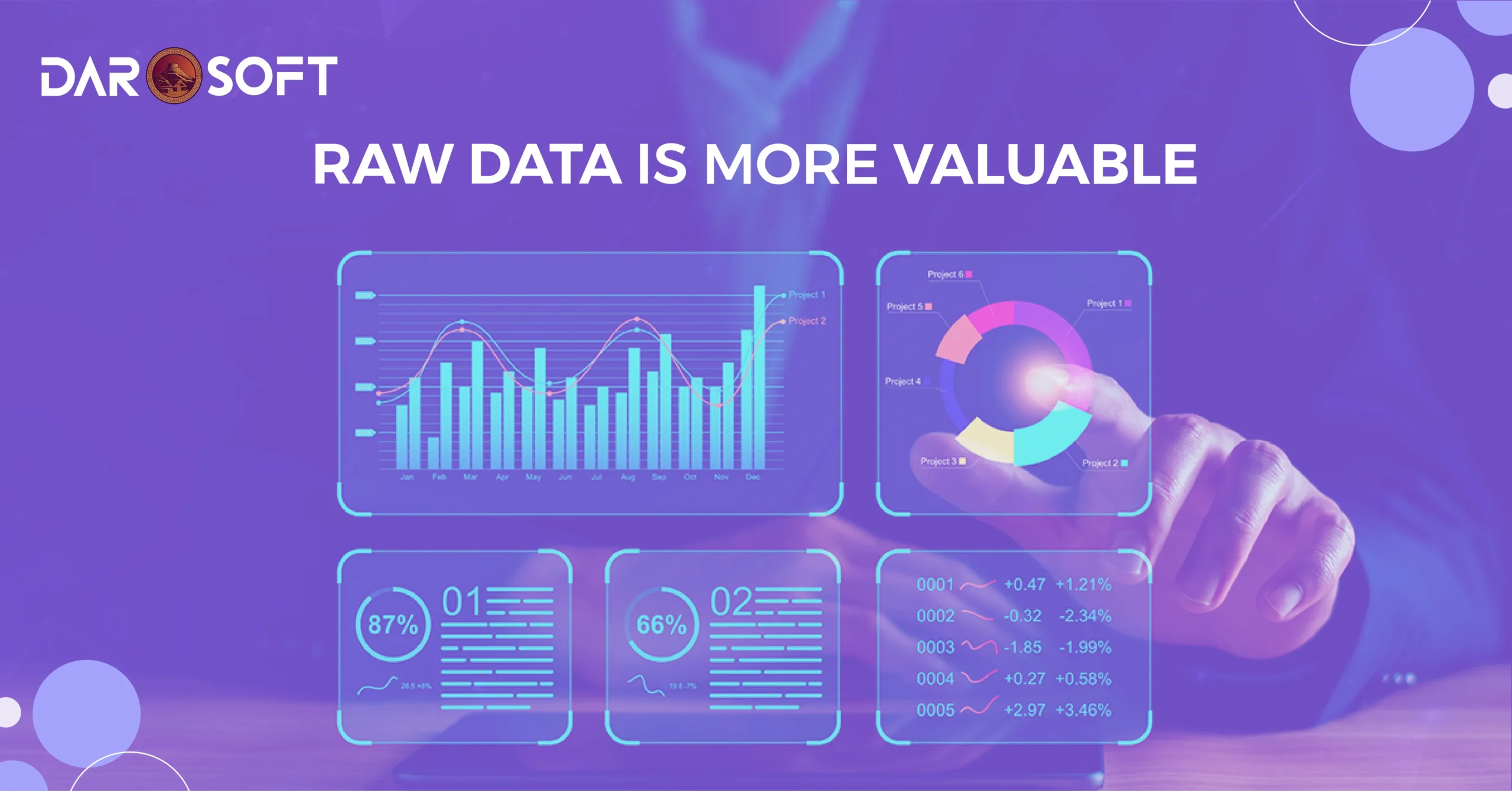
The Role of Visualisation in Seeing the Big Picture
Rows of numbers and raw text might hold the truth, but it’s hard for the human brain to spot trends or patterns buried inside them. That’s where data visualisation becomes a game-changer, turning dense information into clear, visual stories that drive action.
Why Visualisation Matters
Our brains process visuals 60,000 times faster than text. When decision-makers see data presented as a chart, dashboard, or heatmap, they can quickly:
Spot unusual patterns or anomalies
Identify correlations between variables
Compare performance across time, regions, or products
Example: A monthly sales table may hide a slow but steady decline in one region, but a line graph makes the downward trend impossible to miss.
Tools That Bring Data to Life
Whether you’re a small business or a global enterprise, visualisation tools help you transform raw data into clarity:
Power BI and Tableau for interactive dashboards
Google Data Studio for budget-friendly visualisation
Excel or Google Sheets for quick charts and pivot tables
Looker or Qlik for enterprise-scale analysis
Visualisation Types for Different Goals
Line Charts → Track changes over time (sales trends, website traffic, temperature shifts)
Bar Charts → Compare categories (regional sales, product performance)
Heatmaps → Show intensity or frequency (customer behaviour patterns, server load)
Pie/Donut Charts → Display proportions (market share, budget allocation)
Scatter Plots → Reveal relationships (ad spend vs. revenue)
From Insights to Opportunities
The real value of visualisation isn’t just making data “pretty,” it’s about enabling faster, better decisions.
Spot risks early: A spike in support tickets can signal product issues before they escalate.
Find growth pockets: A dashboard might reveal an untapped customer segment with high conversion rates.
Optimise performance: Trend lines can show which marketing channels deliver the best ROI over time.
Tools That Do the Heavy Lifting
From advanced analytics platforms to AI-powered assistants, the right technology stack can transform your raw data into clear, actionable intelligence faster and more accurately than any manual process.
Analytics Software: Turning Numbers Into Narratives
Analytics platforms are the foundation for making sense of data.
Google Analytics → Ideal for tracking web traffic, user behaviour, and campaign performance.
Microsoft Power BI → Connects multiple data sources to create interactive dashboards.
Tableau → Known for beautiful, deep visualisations that uncover patterns at a glance.
Looker → A Google Cloud tool for embedded analytics and real-time reporting.
Pro tip: Select an analytics platform that seamlessly integrates with your CRM, ERP, or marketing tools to eliminate the need for manual data imports.
AI-Powered Insights: Smarter, Faster Decisions
Artificial Intelligence can process and interpret massive datasets in seconds, spotting patterns and anomalies humans might miss.
ChatGPT & GPT-powered copilots → Summarize reports, suggest trends, and even draft business recommendations.
IBM Watson Analytics → Uses machine learning to discover patterns in structured and unstructured data.
DataRobot → Automates model selection and predictive analytics.
Real-world example: AI-driven anomaly detection can flag unusual spikes in customer churn before it impacts revenue.
Automation Platforms: Eliminating Busywork
Automation tools streamline repetitive data tasks so teams can focus on strategy.
Zapier → Connects apps and automates workflows without coding.
Integromat / Make → Handles complex, multi-step data flows between systems.
Alteryx → Prepares, blends, and analyses data automatically.
Impact: Instead of manually updating spreadsheets, automation can pull fresh data from multiple sources every morning and update dashboards automatically.
Industry-Specific Solutions
Some tools are built for niche needs, perfect for organisations with unique data challenges:
Logisticify → Real-time logistics data tracking and reporting for supply chain managers.
Salesforce Einstein → AI-driven sales forecasts and customer insights.
QuickBooks Advanced Reporting → Tailored for finance teams managing accounting data.
Conclusion
You can have the most advanced dashboards, the cleanest datasets, and the flashiest visualisations in the world, but if no one acts on them, it’s all just background noise.
The true value of data lies in execution. Every insight should lead to a decision, every trend should spark a strategy, and every alert should trigger a response.
The winning formula is simple:
See it → Identify the opportunity or threat in your data.
Decide → Choose the smartest, most impactful course of action.
Do it → Implement quickly, measure results, and adjust.
In fast-moving market, speed matters as much as accuracy. The organisations that thrive aren’t just those with the most information; they’re the ones that turn insights into results before competitors even spot the opportunity.
Takeaway: Don’t let your data collect dust. Turn it into action, and turn action into growth.