- Written by: Hummaid Naseer
- July 8, 2025
- Categories: UI & UX
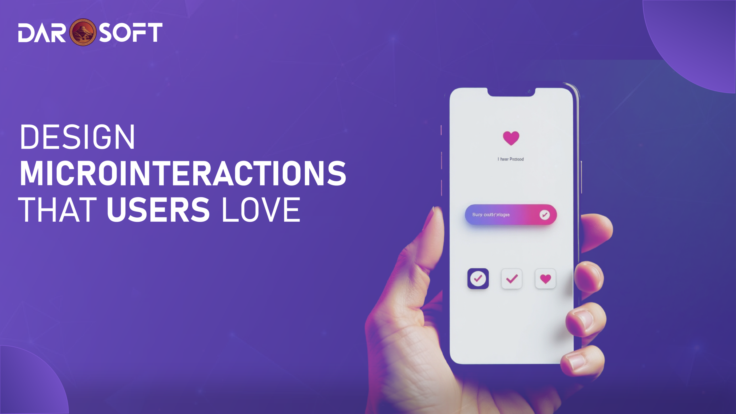
Microinteractions are the tiny, often overlooked details in a user interface, like a heart icon pulsing after a “like,” a progress bar loading smoothly, or a swipe animation confirming an action. While they happen in milliseconds, their impact is massive. These subtle cues reduce uncertainty by confirming actions, guide users seamlessly through tasks, and inject moments of delight that make digital experiences feel intuitive and human. Far from being mere decoration, microinteractions build trust, enhance clarity, and drive user engagement by making every interaction feel smoother, smarter, and more satisfying.
The UX Behind the “Small Moments”
Microinteractions are the subtle, often overlooked details in digital interfaces that enhance user experience by providing feedback, guiding behavior, and creating a sense of responsiveness. These include elements like button hover states, loading spinners, swipe animations, toggle switches, form validation messages, and progress indicators. While small in size, their impact is significant; they communicate system status, reinforce actions, and reduce uncertainty, making interfaces feel intuitive and alive. Functionally, they help users complete tasks with confidence. Emotionally, they add personality, delight, and polish, shaping how users perceive your product and brand. In short, microinteractions turn cold interfaces into engaging experiences.
The Psychology of Microinteractions
Microinteractions tap into core psychological principles by giving users a sense of control, clarity, and satisfaction during digital interactions. When a button animates on click, or a loading bar signals progress, it provides immediate feedback, a fundamental UX rule that confirms the system has received and is processing a user’s action. This reduces uncertainty and builds trust. Microinteractions also enhance the sense of control by making interfaces feel responsive and predictable; users know what to expect and can navigate with confidence. On an emotional level, these small moments create delight, a flicker of personality or polish that makes digital experiences feel more human and enjoyable. When done well, microinteractions improve usability and deepen emotional connection, turning routine tasks into pleasant interactions.
Components of a Microinteraction
A well-crafted microinteraction is made up of four core components, each playing a vital role in creating a seamless and engaging user experience:
Trigger: This is what initiates the microinteraction. It can be user-initiated (e.g., clicking a “like” button or toggling a switch) or system-initiated (e.g., receiving a new message notification). The trigger sets the interaction in motion.
Rules: These define what happens after the trigger. They are the invisible logic that determines the sequence and boundaries of the microinteraction. For example, when you toggle dark mode, the rules dictate which elements switch colors and how quickly.
Feedback: Feedback is how the system communicates back to the user, indicating that their action was recognized and processed. It can be visual (a loading spinner), auditory (a notification chime), or haptic (a vibration). This step is crucial for user confidence and flow.
Loops and Modes: Loops determine the duration or repetition of a microinteraction (e.g., does it repeat, fade out, or reset?), while modes handle variations based on context or state (e.g., a mute button that switches icons and function based on whether a sound is on or off).
Together, these components create a cohesive, intuitive microinteraction that supports user flow, minimizes friction, and enhances usability. Often, without the user even realizing it.
Microinteractions for Maximum Impact
Microinteractions shine when used at strategic points in the user journey to improve clarity, boost engagement, and create a sense of flow. Here are key touchpoints where microinteractions make the most impact:
Onboarding Experiences: Use animations and feedback to guide users through new features or interfaces, highlighting where to click, swipe, or explore. Subtle prompts can reduce confusion and increase feature adoption.
Buttons & Toggles: Add hover states, press animations, or toggling effects to indicate interactivity and confirm actions. For example, a heart icon filling in when clicked instantly reassures the user that their action was successful.
Form Validation: Real-time feedback (green checkmarks, red error hints, subtle shake animations) helps users correct errors immediately, reducing frustration and increasing form completion rates.
Notifications: Alert animations, badge counts, or toast messages keep users informed of system events or updates without disrupting their workflow, especially useful in apps that require real-time interaction.
Empty States & Error Recovery: Microinteractions in these moments can reduce user anxiety. Friendly illustrations, encouraging messages, or retry buttons with animations turn negative experiences into moments of trust-building and support.
Used thoughtfully, microinteractions don’t just improve UX they bring your product to life by adding polish, predictability, and emotional intelligence to every user action.

Keep UX Subtle and Purposeful
While microinteractions can enhance usability and delight, they must be handled with restraint and intention. Overuse or poorly executed animations can easily backfire, causing distraction, cognitive overload, or user frustration. Best practices suggest that microinteractions should always serve a clear purpose, providing feedback, guiding action, or reinforcing consistency. Avoid animations that are too long, too flashy, or inconsistent across components, as they can disrupt flow and feel gimmicky. Consistency in motion patterns, timing, and tone is key to maintaining a cohesive experience. The best microinteractions are almost invisible. Users feel them more than they consciously notice them. In short, be purposeful, stay subtle, and let function lead form.
Designing Microinteractions That Feel Human
Microinteractions may be small, but their ability to humanise digital products is profound. When thoughtfully crafted, they transform sterile interfaces into responsive, emotionally intelligent experiences that users feel connected to. To achieve this, designers must consider four key human-centered elements: tone, timing, feedback type, and context-awareness.
1. Tone: Reflecting Emotion in Interaction
The tone of a microinteraction reflects the emotional character of your brand and sets the mood of the interaction. For example:
A playful toggle animation with a bounce can make a fitness app feel energetic and fun.
A smooth, gentle fade-in for error messages in a banking app keeps the experience calm and professional during potentially stressful moments.
Success messages can include subtle celebration cues (e.g., confetti particles or checkmarks with soft sounds) to make users feel accomplished.
2. Timing: The Pace of Human Perception
Microinteractions should move at a pace that feels natural and intentional. If they’re too fast, users might miss them. If they’re too slow, they may cause frustration.
Ideal Duration: Most microinteractions should last between 200ms to 500ms quick enough to avoid disruption, but long enough to be noticeable.
Easing curves (e.g., ease-in-out) help transitions feel more organic, mimicking real-world motion.
Timing is also critical when multiple elements are involved staggered or sequential animations can guide attention smoothly without overwhelming the user.
3. Haptic and Sensory Feedback: Physical Connection
On mobile devices and wearables, haptic feedback adds a tactile dimension that feels more “alive.” A subtle vibration when toggling a switch or confirming payment can increase the sense of control and assurance.
Audio cues (like a soft chime) can complement actions but must be used sparingly and offer mute options.
Visual cues (e.g., color shift, movement) remain the most widely used and should be optimized for accessibility (e.g., for colorblind users).
4. Context-Awareness: Microinteractions That Know When to Speak
Context-aware microinteractions are the most impactful because they show up only when relevant, like a good conversation partner:
During onboarding, progressive form validations or progress bars help users feel guided.
In error states, soft-shaking animations or fading error messages can indicate a problem gently, without making users feel like they failed.
When a task is completed, a micro-animation (like a flying paper plane for sending messages) provides emotional closure.
Building Smart Microinteractions
Designing effective microinteractions requires the right tools for creation, prototyping, and development. Whether you’re a designer animating a button hover or a developer implementing real-time feedback in production, here are the most powerful tools and frameworks to create smart, performant, and human-centered microinteractions:
Design & Prototyping Tools
Tool | What It Does | Use Case |
Figma (Smart Animate) | Allows you to create animated transitions between frames using shared layers and object properties. | Rapid prototyping of button clicks, toggle states, sliders, and mobile transitions. |
Framer | Combines design and code for high-fidelity interactive prototypes using React and animation libraries. | Perfect for showcasing advanced, real-feeling microinteractions (e.g., swipes, drag-and-drop). |
Adobe After Effects + Lottie | Designers animate in After Effects and export lightweight JSON files via Lottie for use on web or mobile. | Great for loading animations, success checkmarks, and branded icon animations. |
ProtoPie | Enables advanced interactions with conditional logic and sensor inputs (tilt, drag, voice). | Ideal for simulating real-world product behavior in mobile apps. |
Development Frameworks & Libraries
Framework/Library | Platform | Strength |
CSS Transitions & Keyframes | Web | Lightweight and native, ideal for simple hover states, form feedback, and UI transitions. |
Framer Motion (React) | Web (React-based) | Developer-friendly animation API for fine-tuned UI animations, drag gestures, and scroll-based effects. |
GSAP (GreenSock Animation Platform) | Web | Robust, high-performance animations across all elements and devices; great for complex timelines. |
React Spring | Web (React) | Physics-based animations that feel natural and fluid are ideal for motion tied to user interaction. |
Lottie for Web/iOS/Android | Multi-platform | Brings After Effects animations into production without converting to GIFs or video; maintains scalability and performance. |
SwiftUI Animations | iOS/macOS | Native iOS support for declarative UI animations (e.g., button feedback, transitions, gestures). |
Jetpack Compose Animations | Android | Android-native animation APIs are built into Kotlin’s Compose framework. |

Do Microinteractions Improve UX
To evaluate whether microinteractions genuinely enhance user experience, you need to go beyond intuition and measure their actual impact through data. Well-designed microinteractions like animated button feedback, error hints, or onboarding cues can improve usability, reduce friction, and guide users more intuitively. But how do you prove this?
Here are effective methods to measure engagement and UX improvement:
1. Session Recordings
Tools like Hotjar, FullStory, or Smartlook capture real user sessions, allowing you to watch how users interact with microelements.
What to look for:
Do users hover over the animated button?
Are tooltip microinteractions being triggered and read?
Are users completing forms faster when visual feedback is provided?
2. Heatmaps
Heatmaps show where users click, hover, and scroll most.
Use Case:
Compare click density before and after adding a microinteraction.
See if subtle animations guide users to CTA buttons more effectively.
Analyze whether tooltips or progress feedback improve engagement on key tasks.
3. A/B Testing
Run controlled experiments by comparing two versions of a UI, one with microinteractions and one without.
Metrics to track:
Click-through rates (CTR) on interactive elements
Task completion time
Bounce or drop-off rates
Conversion or form submission rates
4. Task Completion Rates
Use usability testing platforms like Maze, PlaybookUX, or UserTesting to track:
Time to complete a specific action
Number of errors or retries
Participant feedback on visual clarity and confidence
Why it matters: If a loading spinner or inline error message reduces confusion or retry attempts, it’s proof that the microinteraction works.
5. Qualitative Feedback
Post-session surveys, interviews, or feedback widgets can help uncover emotional responses.
Ask users:
“Did the feedback help you feel confident in your actions?”
“Did anything feel slow, confusing, or too flashy?”
FAQs
What are microinteractions in UX design?
Microinteractions are small, functional animations or interface responses that occur when a user completes a task or triggers an action like toggling a switch, submitting a form, or receiving a notification. They provide feedback, improve usability, and add emotional delight.
Do microinteractions improve user engagement?
Yes, when used purposefully, microinteractions improve task completion rates, reduce errors, and make interfaces feel more intuitive. They help users understand system status and give confidence that actions were successful.
Where should I use microinteractions for maximum impact?
Key touchpoints include:
Onboarding flows
Buttons and toggles
Form validation and error handling
Empty states or success messages
Loading indicators and transitions
Can too many microinteractions hurt the user experience?
Absolutely. Overusing animations or making them too flashy, inconsistent, or slow can cause distraction, delay, or annoyance. Microinteractions should be subtle, purposeful, and aligned with user intent.
What tools can I use to design microinteractions?
Popular tools include:
Figma (Smart Animate)
Framer Motion (for React)
Lottie (for lightweight animations)
CSS transitions/animations
ProtoPie, Principle, and After Effects for prototyping
Conclusion
Microinteractions may be small in scale, but their impact on user experience is significant. Far from being decorative flourishes, they serve as critical touchpoints that guide, reassure, and emotionally connect users with digital products. Whether it’s a subtle loading spinner, a satisfying button click, or a clear error message, these moments create a sense of responsiveness and intentionlly. When designed thoughtfully with purpose, consistency, and empathy, microinteractions enhance clarity, reduce friction, and elevate the overall usability and personality of an interface. In a world where attention spans are short and competition is high, these “small moments” are what often defines the success of user engagement.