- Written by: Hummaid Naseer
- August 12, 2025
- Categories: UI & UX
Typography guides the eye, sets the mood, and anchors your visual hierarchy. A clean, modern sans-serif suggests innovation and simplicity. A serif font may evoke tradition and credibility. Even letter spacing and line height can signal professionalism or chaos.
Great UX isn’t just what’s said, it’s how it’s said. Typography gives voice to your interface, shaping the rhythm of user interaction and reinforcing what your brand stands for. In a world crowded with pixels and choices, the right typeface can turn information into experience and visitors into believers.
Why Typography Is a UX Superpower
Typography isn’t just a matter of aesthetics, It’s a core pillar of user experience. From the ease of reading a sentence to the subtle emotional cues that influence user trust and brand perception, the fonts you choose have a measurable impact. Here’s how typography acts as a UX superpower across every stage of design and interaction:
Readability: The Foundation of Usability
If users can’t easily read your content, they can’t use your product. Good typography ensures clarity by optimizing:
Font size & hierarchy – Helps users scan and prioritize information.
Line length & spacing – Ideal line lengths (45–75 characters) and line height (1.4–1.6x) improve legibility.
Contrast & color – Ensures accessibility across all devices and lighting conditions.
“Legibility is about recognizing letters; readability is about understanding content.”
Hierarchy: Guiding the User’s Eye
Typography creates visual structure, enabling intuitive navigation:
Headings vs. body text – Size, weight, and spacing define content blocks and flow.
Consistent patterns – Help users recognise types of content (e.g., instructions vs. CTAs).
Microcopy styling – Tooltips, error messages, and labels need a voice, too.
Emotion & Personality: Setting the Tone
Fonts carry emotional weight. Typography shapes how users feel:
Serif fonts – Classic, trustworthy, editorial.
Sans-serif fonts – Modern, clean, tech-savvy.
Script or display fonts – Playful, creative, expressive.
“Typography is voice made visible. A serious brand won’t speak in Comic Sans.”
Cognitive Load: Making Thinking Easier
Well-structured typography reduces mental effort:
Consistent rhythm – Creates familiarity and lowers friction.
Whitespace – Gives the brain breathing room to absorb content.
Simplified styles – Avoids font overload and confusion.
“The best typography fades into the background and lets the message shine.”
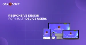
Responsiveness: Adapting Across Devices
Typography must perform across screen sizes and devices:
Fluid sizing (e.g., rem, em) – Adapts text to screen resolution.
Adaptive line spacing – Improves readability on small screens.
Font loading performance – Impacts perceived speed and SEO.
Trust & Brand Perception: Silent Influence
Users form subconscious judgments based on type:
Clean typography – Signals professionalism and credibility.
Consistent branding – Reinforces trust and identity.
Mismatch = friction – A fintech app using a cartoonish font erodes confidence.
7. Typography in Action: Small Details, Big Impact
CTA Buttons – Bold, all-caps, and tightly tracked for urgency.
Forms & Inputs – Clear labels, spacious alignment for ease.
Error States – Red, italic, or bold text to draw attention without shouting.

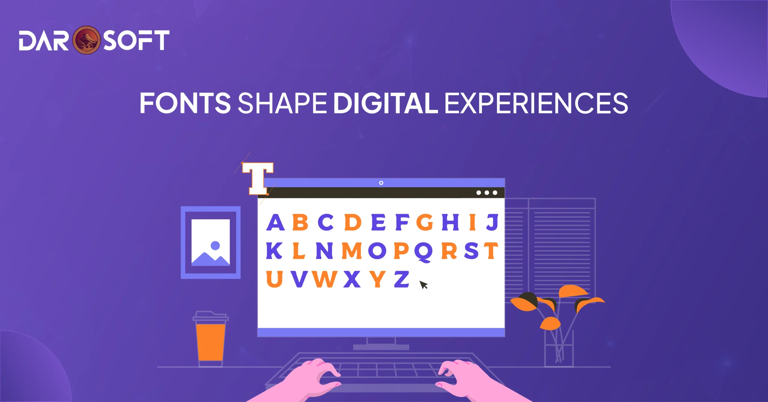
How Letter forms Influence User Behaviour
Every letter form you select shapes how users feel, think, and act when they interact with your product or brand. Fonts carry subconscious cues that influence everything from trust and attention to emotion and action. Here’s how:
First Impressions: Fonts Speak Before Words Do
Before users read a single sentence, their brains are already interpreting the tone through your typography. A sleek sans-serif signals modernity, while a traditional serif hints at authority and heritage.
Font Style | Psychological Cue | Common Use Cases |
Serif | Trustworthy, classic | Legal, editorial, finance |
Sans-serif | Modern, clean, approachable | Tech, startups, digital products |
Script/Handwritten | Creative, personal, emotional | Lifestyle, luxury, storytelling |
Display | Bold, attention-grabbing | Headlines, entertainment, branding |
Letter forms Influence Emotion and Memory
Humans are visual creatures. The shape, weight, and spacing of letter forms can elicit emotional responses that affect memory retention and decision-making:
Rounded fonts feel soft and friendly (e.g., Google Sans, Nunito)
Sharp, angular fonts feel strong or aggressive (e.g., Impact, Bebas Neue)
Narrow, tall fonts can feel elegant or tense
Wide, spaced-out fonts give a feeling of calm or luxury
“Typography evokes mood before a word is even processed consciously.”
Typography Affects Perceived Difficulty
Psychology studies show that hard-to-read fonts increase cognitive load. This means users:
Spend more time deciphering content
They are more likely to misinterpret instructions
Feel less confident in their decisions
On the flip side, clean, legible fonts with good contrast:
Increase trust
Enhance comprehension
Lead to better task performance
Action-Oriented Fonts Can Drive Conversions
The typeface you use on CTAs and buttons matters. Fonts that are:
Bold
Uppercase
Slightly condensed
…are statistically more likely to capture attention and encourage clicks. That’s why many landing pages use strong sans-serifs like Helvetica, Inter, or Montserrat for key actions.
A weak font makes a strong CTA feel uncertain. A bold font gives it conviction.
Consistency Builds Trust, Inconsistency Breeds Confusion
Changing fonts too often or using too many at once can confuse or frustrate users. Typography inconsistency can make users subconsciously doubt the credibility of your product or site.
Stick to a type system:
A primary font for body and headings
A secondary font (optional) for accents
Consistent line heights, spacing, and weights
Typography as Functional Design
How text looks directly affects how it works. Font choices determine not only what users see, but what they understand, how they feel, and what they do. Here’s how typography moves beyond decoration into purposeful design:
Legibility Is Usability
No matter how elegant a font looks, if it’s hard to read, it fails the user.
Font size, line height, and contrast must support readability on all devices.
Serif fonts may work in print, but sans-serif fonts are often better on screens, especially for smaller text.
Proper letter spacing (kerning) prevents visual fatigue and scanning errors.
Rule of thumb: If your grandma can’t read it on mobile, it’s not usable.
Typography Guides Visual Hierarchy
Typography helps users scan, prioritise, and navigate content.
Headings with distinct sizes and weights indicate content importance.
Bold or italicised text draws attention to key actions or alerts.
Consistent hierarchy across screens builds familiarity and flow.
Good typography creates a roadmap through your interface, without needing a legend.
Efficient Scanning Reduces Cognitive Load
Most users don’t read, they scan. Typography that supports this behaviour:
Breaks content into digestible chunks using font weights, bullets, and spacing.
Highlights actionable text with buttons, links, or subtle cues (like underlines or colour shifts).
Uses short, scannable line lengths (~45–75 characters per line) for comfort.
The easier it is to process, the faster users make decisions.
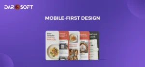
Responsive Typography = Seamless Experience
Functional design must adapt to all screens—mobile, tablet, desktop.
Use relative units (em/rem) instead of fixed px for flexible scaling.
Adjust line height and font weight for legibility across breakpoints.
Ensure interactive text elements (buttons, forms) maintain size and clarity under touch.
Typography that breaks on mobile = UX that breaks on mobile.
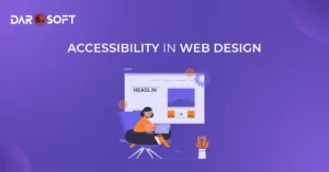
Accessible Typography Is Inclusive Design
Your type decisions can include or exclude entire user groups.
Meet WCAG standards with sufficient colour contrast and clear typefaces.
Avoid text in all caps for body copy. It’s harder for dyslexic users and screen readers.
Choose system fonts or web-safe fonts that load reliably and perform well on slow connections.
If your font can’t be read by assistive tech, it’s not functional—it’s decorative noise.

Right Typography Boosts Trust, Clarity, and Conversion
Typography doesn’t just deliver information it shapes perception. Fonts have a psychological impact that influences how users feel about your product, how easily they engage with content, and whether they feel confident enough to take action. Below is how typography drives three core outcomes in UX:
Trust: Fonts Signal Credibility
Typography is one of the first visual cues users notice, often before reading a word. The right font choice communicates professionalism, consistency, and authority.
Clean, modern sans-serifs (like Inter, Lato, or Helvetica) convey transparency and tech-savviness.
Classic serif fonts (like Georgia or Times) evoke tradition, trust, and formality great for finance or healthcare.
Inconsistent typography (mismatched fonts, poor spacing, awkward alignment) creates visual dissonance and erodes credibility.
When users subconsciously trust the visual tone, they’re more likely to trust your product or service.
Clarity: Typography Structures Thought
Good typography organises information so users understand it easily, without overthinking.
Clear hierarchy (headings, subheadings, body text) guides the eye and helps users scan.
Readable typefaces with sufficient spacing reduce fatigue and cognitive load.
Emphasis tools bold, italic, and colour accents, can highlight key actions without being intrusive.
Clarity breeds comprehension, and comprehension increases retention.
Conversion: Fonts Influence Behaviour
Typography directly impacts the emotional tone and user confidence that drive conversion:
Button labels, form fields, and pricing text must be legible, direct, and visually distinct.
Urgency or reassurance cues (“Free Trial,” “Secure Checkout”) should be emphasised with confident, bold type, not hidden in fine print.
A consistent, well-executed typographic system creates a polished experience that subconsciously reassures users they’re in capable hands.
When typography is clear, confident, and usable, users are more likely to click, sign up, or buy.
Typography Impacts Perceived Professionalism and Brand Personality
Typography is one of the most overlooked yet most powerful elements in shaping how users perceive your brand. It silently communicates trustworthiness, tone, and intention before a single sentence is read. Whether you’re a minimalist startup, a luxury fashion label, or a government portal, your font choices speak volumes about your professionalism and personality.
First Impressions Are Typographic
Typography is often the first design signal your users receive. In milliseconds, they make assumptions:
Is this brand modern or outdated?
Is it playful or serious?
Can I trust this site with my data or money?
Fonts are processed visually, but their impact is psychological.
Professionalism: Fonts Set the Tone for Trust
Certain typefaces are more commonly associated with professionalism, clarity, and reliability. Here’s how typography shapes that perception:
Type Style | Perception | Best For |
Sans-Serif (e.g., Helvetica, Inter, Roboto) | Clean, modern, efficient | Tech, SaaS, startups |
Serif (e.g., Georgia, Merriweather, Times) | Traditional, established, credible | Law, education, and healthcare |
Slab Serif (e.g., Roboto Slab, Arvo) | Confident, bold, authoritative | Editorial, fintech, enterprise |
Monospaced (e.g., Courier, IBM Plex Mono) | Technical, functional | Developer tools, terminal-style UIs |
Consistency in font weights, sizes, and spacing signals attention to detail, which users often equate with operational reliability.
Brand Personality: Fonts as Visual Voice
Typography also carries emotion and voice. Choosing the right font helps embody your brand’s unique character:
Brand Personality | Typography Style |
Playful & Friendly | Rounded fonts (e.g., Nunito, Poppins), bold weights, vibrant display fonts |
Luxury & Elegant | High-contrast serifs (e.g., Playfair Display, Cormorant), generous letter spacing |
Minimal & Modern | Light sans-serifs (e.g., Lato, Avenir), monochrome palette |
Tech-Forward & Futuristic | Geometric fonts (e.g., Orbitron, Exo), sleek all-caps styles |
Earthy & Handcrafted | Script or slab fonts (e.g., Pacifico, Raleway), textured typography |
Caution: Misaligned fonts can cause user confusion or undermine your message. A fintech app with a comic-style font may feel untrustworthy. A luxury site with default system fonts may seem amateur.
Typography and Voice Consistency
Fonts should also match the tone of your copy writing:
A casual voice needs a warm, open typeface.
A formal voice pairs best with structured, mature typefaces.
Accessibility and inclusiveness also matter; high contrast, legibility, and clarity affect brand perception and usability.
Conclusion
Clean, legible, and emotionally resonant typography makes digital experiences easier to navigate and more memorable. It reduces cognitive load, enhances usability, and can even tip the scales between hesitation and action. Whether you’re crafting a fintech platform, a lifestyle app, or an enterprise dashboard, your font choices aren’t just aesthetic decisions; they’re strategic UX tools.