- Written by: Hummaid Naseer
- September 12, 2025
- Categories: UI & UX
A website is often the first interaction a customer has with your brand. Studies show that users form an opinion about a site’s credibility within seconds, and design plays the biggest role in that judgment.
A cluttered, outdated, or slow website can create doubts about professionalism and reliability, regardless of the quality of your product or service. On the other hand, a clean layout, modern visuals, and intuitive navigation instantly signal trust, authority, and attention to detail.
Good design isn’t just about beauty, it’s about building confidence from the very first click. When users trust what they see, they’re more likely to stay, explore, and take action.
Visual Consistency as a Reflection of Professionalism
When a visitor lands on your website, they instantly begin forming judgments about your business, often in less than a second. One of the strongest subconscious signals that influences trust is visual consistency.
Why Consistency Matters
A consistent design tells users that the business is organized, reliable, and pays attention to detail. If your website looks polished and aligned, visitors are far more likely to associate those qualities with your services or products. On the other hand, mismatched colors, uneven typography, and inconsistent layouts send the wrong message that the brand may lack professionalism or credibility.
Think of it like walking into a physical store:
If the signage, décor, and branding are uniform and aligned, you feel confident about the business.
But if every section looks different, with clashing styles and no sense of order, you may hesitate to trust it.
The same psychology applies online. Inconsistency creates doubt; consistency creates confidence.
The Usability Advantage
Beyond aesthetics, consistency directly impacts user experience (UX). When fonts, button styles, and layouts are predictable across pages, visitors don’t waste time figuring out how to interact with your site. They can focus on the content and actions you want them to take, whether that’s filling out a form, purchasing a product, or booking a service.
Studies show that familiar design patterns increase conversions because users feel comfortable and in control. When design feels disjointed, visitors experience cognitive load; they need extra effort to process what’s happening, which often leads to drop-offs.
Building Recognition and Brand Recall
Consistency also fuels brand recognition. Using the same brand colours, logo placement, typography, and tone across your website and other channels makes your brand easier to remember. Over time, this recognition fosters loyalty, and customers begin to trust your brand simply because they know what to expect.
Best Practices for Achieving Visual Consistency
Create a Design System or Style Guide: Define colours, typography, icon styles, spacing rules, and imagery standards.
Stick to a Grid: Using grid-based layouts ensures alignment and balance across all sections.
Use Consistent UI Elements: Buttons, forms, and navigation should look and behave the same across pages.
Align Content and Design: Visuals, tone, and copywriting should reinforce each other instead of feeling disconnected.
Clean Navigation = Confidence in the Brand
Navigation is the backbone of any website. If users can’t quickly find what they’re looking for, frustration sets in, and they’re likely to leave. But when navigation is clear, simple, and intuitive, it builds a sense of confidence both in the website and the business behind it.
Why Navigation Shapes Trust
Your navigation menu acts like the map of your business online. If it’s cluttered with too many options, hidden links, or confusing labels, visitors may assume the company itself is disorganised. On the other hand, a clean navigation structure communicates professionalism, clarity, and user respect.
Think of navigation like customer service:
A confusing menu is like walking into a store where no one greets you and the aisles are a mess.
A clean, clear menu is like being guided by a helpful representative who makes sure you know exactly where to go.
When users feel guided, not lost, they’re more likely to trust your brand and engage further.
The Usability Factor
A clean navigation system reduces cognitive load, the mental effort required to figure out where things are. The fewer decisions users have to make, the easier it is for them to focus on what matters: your products, services, or content.
For example:
A simple top menu with 5–7 core options works better than a drop-down cluttered with 20 items.
Grouping similar pages under logical categories (e.g., “Products,” “Solutions,” “Resources”) keeps the user journey smooth.
Research shows that intuitive navigation boosts time-on-site and conversion rates because users feel in control rather than overwhelmed.
Brand Perception and Confidence
When your navigation feels effortless, visitors subconsciously equate it with trustworthiness. They believe:
If you make it easy for them to explore your website, you’ll also make it easy for them to work with you.
If your structure is well thought out, your business must be equally organised in operations.
This subtle but powerful impression often decides whether a visitor turns into a customer.
Best Practices for Clean Navigation
Keep It Simple: Stick to essentials, don’t overload menus.
Use Clear Labels: Avoid jargon, use words your users instantly understand.
Ensure Consistency: Navigation should look and behave the same across all pages.
Make It Mobile-Friendly: Menus should adapt cleanly to smaller screens without hiding key pages.
Highlight CTAs: Important actions like “Contact Us” or “Get a Quote” should stand out.
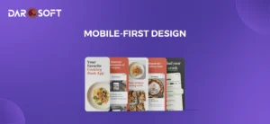
Mobile-First Design Shows You Care About Users
Mobile devices are the primary gateway to the internet. Studies show that more than half of all web traffic worldwide comes from smartphones, and in many industries, that percentage is much higher.
For businesses, this means that designing for mobile-first is no longer optional. It’s a statement that says, “We respect your time, we value your convenience, and we’ve built this experience with you in mind.”
Why Mobile-First Matters
Imagine a potential customer visiting your website on their phone and struggling with:
Pinching and zooming to read text.
Buttons too small to tap.
Menus hidden behind clunky drop downs.
These frustrations don’t just cost you clicks; they erode trust. A mobile-first approach flips the design process: instead of squeezing a desktop site into a smaller screen, you start with mobile in mind and then scale up for larger devices.
This ensures that the core experience is seamless where it matters most: on the device people are using.
User Experience = Brand Care
A mobile-optimised site shows customers that you care about their needs. Smooth scrolling, legible fonts, tappable buttons, and quick-loading pages make users feel respected. When they don’t have to fight with your design, they naturally feel more positive about your brand.
In other words: a good mobile experience = a good brand impression.
Business Impact
Lower Bounce Rates: Mobile users stay longer when navigation is smooth.
Higher Conversions: Simplified mobile checkouts and forms directly boost sales.
SEO Advantage: Google ranks mobile-friendly sites higher in search results.
Customer Loyalty: People remember frustration, but they also remember convenience.
Best Practices for Mobile-First Design
Prioritize Speed: Optimise images and code for quick loading.
Simplify Navigation: Use clean menus and avoid overwhelming drop downs.
Readable Typography: Large, legible fonts tailored for small screens.
Touch-Friendly Elements: Buttons should be easy to tap without zooming.
Progressive Enhancement: Start with mobile essentials, then add advanced features for desktop.
The Role of Speed & Performance in Building Credibility
In today’s fast-paced digital world, every second counts. Studies consistently show that users expect websites to load in under 3 seconds; anything longer, and they start to lose patience. Slow-loading websites don’t just frustrate users; they actively damage credibility and trust.
Think about it: if your website lags, freezes, or takes forever to load, what does that say about your business? Users often subconsciously equate website performance with business reliability. A slow site makes people question whether your company is modern, efficient, and trustworthy.
Why Speed Equals Trust
First Impressions Stick: A fast, responsive website creates an instant sense of professionalism.
Reduced Bounce Rates: When users get information quickly, they’re more likely to stay and engage.
Smooth Interactions = Confidence: Fast page transitions, responsive forms, and snappy navigation give users confidence in your brand.
SEO Benefits: Google prioritises faster websites, meaning performance directly impacts your visibility.
Business Consequences of Slowness
Lost Customers: A 1-second delay in page load can reduce conversions by up to 7%.
Damaged Reputation: Users may assume your company is outdated or careless.
Competitive Disadvantage: In industries where speed matters (e-commerce, SaaS, logistics), being slower than competitors can cost you deals.

Typography and Colour Psychology
When visitors land on your website, they don’t consciously analyse fonts or colour schemes, but these design choices quietly shape how they feel about your brand. Typography and colour psychology work behind the scenes, sending subtle signals of professionalism, stability, and trustworthiness.
Typography: More Than Just Fonts
Typography sets the tone for how your brand communicates. A font isn’t just text; it’s personality in pixels.
Sans-Serif Fonts (e.g., Helvetica, Arial): Clean, modern, and straightforward. They suggest clarity and efficiency.
Serif Fonts (e.g., Times New Roman, Georgia): Traditional, authoritative, and stable, often used by financial or legal firms to build credibility.
Custom or Playful Fonts: Creative, but risky. If overused, they can feel unprofessional or harm readability.
Trust Tip: Consistency is key. Mixing too many font styles feels chaotic and undermines reliability.
Colour Psychology: Speaking Without Words
Colours tap into human psychology, influencing emotions and perceptions instantly:
Blue: Trust, security, professionalism (popular in tech, finance, and healthcare).
Green: Growth, balance, sustainability (common for eco-friendly and wellness brands).
Black/Gray: Authority, sophistication, seriousness (used in luxury and corporate design).
Orange/Yellow: Energy, optimism, creativity (great for startups, but use carefully to avoid looking unserious).
When paired with typography, colours amplify the brand’s voice. For example, a deep blue serif font conveys tradition and trust, while a bold sans-serif in bright green signals innovation and eco-consciousness.
Why This Matters for Credibility
Consistency = Stability: Uniform typography and a cohesive colour palette reassure users that your brand is well thought out.
Legibility = Respect: Clear fonts and accessible colour contrasts show you value user experience.
Emotional Resonance: The right colour scheme makes people feel they’re in safe hands.
Best Practices
Stick to 2–3 typefaces and maintain a consistent hierarchy (headings, body, buttons).
Choose a primary brand colour and 1–2 supporting tones for accents.
Always check colour contrast ratios for accessibility compliance.
Test designs on different screens (desktop, mobile, tablet) to ensure clarity everywhere.
Designer’s Perspective
Typography and colours are the silent ambassadors of trust. They don’t shout, they whisper confidence into the user’s subconscious, nudging them toward seeing your brand as reliable, credible, and professional.
Authentic Imagery vs. Stock Photos
When users visit your website, they want to see the real story behind your brand, not the same generic smiling faces they’ve already spotted on dozens of other sites. Images carry powerful emotional weight, and the choice between authentic photography and stock photos can make or break that first impression.
Why Authentic Imagery Wins Trust
Human Connection: Photos of real employees, offices, or products create relatability. Users feel they’re engaging with a genuine company, not just a polished façade.
Transparency: Showing your team, workspace, or behind-the-scenes moments signals honesty and openness.
Brand Personality: Custom photography highlights what makes your company unique, your culture, your people, and your environment.
Example: A local café that shows its baristas at work builds far more credibility than one using a generic “smiling coffee drinker” stock photo.
The Pitfalls of Overused Stock Photos
Generic & Forgettable: Users have seen that same “handshake in a suit” or “call center smile” a hundred times before. It feels impersonal and inauthentic.
Trust Gap: Stock photos can raise doubts if you aren’t willing to show the real side of your business. What are you hiding?
Mismatch: Sometimes, stock images don’t align perfectly with your brand tone, creating dissonance between what you say and what you show.
Striking the Right Balance
Authentic photography doesn’t mean you can never use stock photos; it means using them strategically.
Use authentic photos for people, products, offices, and brand culture.
Use high-quality stock photos only when they complement your message (e.g., abstract concepts, landscapes, textures).
Always edit and style stock photos to match your brand’s colour scheme and aesthetic for consistency.
Why This Matters for Credibility
Familiarity Breeds Trust: Real visuals humanise your business.
Differentiation: Authentic imagery sets you apart from competitors who rely on the same stock photo libraries.
Engagement: Users are more likely to spend time on a site that feels human and relatable.
Designer’s Perspective
Authentic imagery communicates truth, warmth, and relatability. It’s not about being perfect. It’s about being real. When customers see your actual people, they’re more likely to believe in your story and connect with your brand emotionally.
Accessibility and Inclusivity as Trust Builders
A truly trustworthy website welcomes everyone. Accessibility and inclusivity aren’t just technical checkboxes. They are strong signals that a brand values all users, regardless of ability, background, or context. In 2025 and beyond, designing for inclusivity is no longer optional; it’s a core expectation.
Why Accessibility Builds Trust
Equal Access: A site that’s easy to navigate for people with visual, auditory, or motor impairments demonstrates fairness and responsibility.
Compliance & Credibility: Adhering to accessibility standards (like WCAG) shows professionalism and reduces legal risks.
User-Centered Design: When users notice features like readable fonts, alt text, and clear navigation, they see a brand that cares about their experience.
Example: An e-commerce store that provides voice search and screen reader compatibility instantly earns credibility with users who might otherwise struggle to shop online.
Inclusivity Beyond Accessibility
Cultural Sensitivity: Using language, imagery, and examples that respect different backgrounds builds emotional trust.
Gender-Neutral & Respectful Copy: Simple word choices can make websites feel more welcoming.
Localisation: Offering multilingual support or regional content customisation tells users, “This brand is built for you, too.”
Practical Ways to Build Accessible & Inclusive Websites
Ensure proper colour contrast for readability.
Use alt text for all images to aid screen readers.
Offer keyboard-friendly navigation for users who can’t use a mouse.
Provide closed captions or transcripts for videos.
Design with clear, simple language that avoids jargon.
Why This Matters for Credibility
Shows Empathy: Brands that design inclusively demonstrate they genuinely care about people.
Wider Reach: Accessibility opens your website to millions of potential users who are often overlooked.
Trust Through Action: Instead of just claiming values like “diversity” or “inclusion,” accessibility is a visible, practical way of living those values.
Designer’s Perspective
Accessibility is not just about compliance. It’s about human connection. By designing for inclusivity, you’re not just opening doors for more users; you’re showing that your brand is ethical, considerate, and future-ready.

Security by Design: SSL, Badges, and User Confidence
Users may not understand the complexities of encryption, but they instantly recognise the small cues that reassure them their data is safe. From the padlock icon in the browser to visible trust badges, security built into the design directly influences whether a visitor feels confident engaging with your brand.
Why Security Shapes Trust
Instant Signals: Seeing “https://” and a secure padlock in the URL bar immediately assures users that a website takes their safety seriously.
Protection of Data: With rising cyber threats, customers want proof that their personal and financial information is being handled responsibly.
Conversion Impact: Studies show that users are more likely to abandon a cart if they sense even the slightest insecurity on a checkout page.
Key Security Trust Builders
SSL Certificates (HTTPS): A non-negotiable standard today, SSL encrypts data in transit and signals to users that your website is safe.
Trust Badges: Payment verification logos (e.g., Visa, MasterCard, PayPal), third-party seals (e.g., Norton Secured, McAfee Secure), or compliance certifications reassure users of legitimacy.
Visible Privacy Policies & Terms: Clear documentation about how data is used helps reduce hesitation.
Consistent Branding Across Pages: A sudden change in look and feel can feel like a phishing attempt; security is also about continuity in design.
Security in Action
Imagine visiting an e-commerce site:
At checkout, you see the padlock icon, payment provider badges, and a clear privacy statement.
The design feels consistent and polished from product pages to payment gateways.
As a result, you’re far more likely to enter your credit card details without hesitation.
Why This Matters for Credibility
Confidence to Transact: A secure design removes barriers to completing purchases or filling forms.
Professionalism & Authority: Businesses that showcase security communicate that they take customer trust seriously.
Long-Term Loyalty: When users never have to worry about their safety, they build stronger relationships with the brand.
Humanising the Brand
Web design has evolved beyond being a visual showcase; it has become a storytelling medium that shapes how users feel about a brand. Every element, typography, imagery, layout, and motion, plays a role in communicating who you are and why you matter.
Why Storytelling Matters in Web Design
Emotional Connection: A brand story builds relatability. Instead of “just another business,” you become a brand with purpose.
Memorable Experiences: Facts and features are easy to forget, but stories stick. A design that weaves narrative ensures visitors remember you.
Differentiation: In crowded markets, your story is what sets you apart. Design turns abstract values into something tangible.
Storytelling Elements in Design
Hero Sections as the Opening Chapter
The first thing users see should introduce your “why.” Bold visuals, strong headlines, and subtle motion can instantly set the tone.
Colour & Typography as Emotional Cues
Warm tones may suggest approachability, while bold typography might communicate confidence. Each choice shapes how your story is felt.
Imagery & Video for Authenticity
Behind-the-scenes photos, customer testimonials, or short brand films humanise your brand far more than stock photos ever could.
Micro-Interactions as Story Layers
Scroll-triggered animations, hover effects, or progress indicators create a sense of journey, guiding users deeper into your narrative.
Consistent Narrative Flow
From homepage to checkout, every page should reinforce the same brand voice and story thread, ensuring users never feel disconnected.
Storytelling in Action
Imagine a startup that sells eco-friendly packaging:
The homepage opens with a bold line, “Packaging with a Purpose.”
Soft green tones and hand-drawn illustrations emphasise sustainability.
A scroll-through timeline shows how the company evolved, while a testimonial video highlights customer impact.
The design doesn’t just inform, it tells a story of passion, responsibility, and change.
Why It Builds Trust
Authenticity Wins: Users can spot “generic” designs instantly. Story-driven design makes your brand feel human, approachable, and real.
Clarity of Purpose: A clear narrative makes it easy for customers to align with your mission.
Deeper Engagement: When users feel part of your story, they’re more likely to interact, buy, and advocate for your brand.
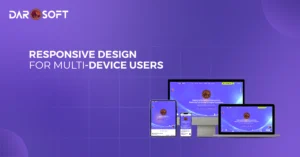
Consistent UI/UX Across Platforms Builds Loyalty
Customers don’t interact with your brand on a single screen. They might discover you on a mobile ad, browse your site on a laptop, and complete a purchase on a tablet or smartwatch. If each touch point looks or feels different, the experience becomes jarring and trust erodes. That’s why consistency in UI (User Interface) and UX (User Experience) is essential for building long-term loyalty.
Why Consistency Matters
Brand Recognition: A familiar layout, colour scheme, and tone across platforms make your brand instantly recognisable.
User Comfort: Users don’t have to “re-learn” how to navigate your site or app on different devices.
Trust Through Predictability: Consistency signals professionalism and reliability. Users know what to expect.
Elements of Consistency
Unified Visual Identity
Logos, typography, and brand colours should remain the same across desktop, mobile, apps, and even social media. This visual harmony reinforces brand memory.
Navigation Patterns
Menus and buttons should behave similarly across platforms. For example, a “Contact Us” button should always be found in the same spot, regardless of device.
Micro-Interactions
Animations, hover effects, and feedback messages (like form submissions) should maintain the same style to create familiarity.
Content Alignment
Messaging tone and content flow should match. A witty, playful tone on mobile should not suddenly become overly corporate on desktop.
Cross-Device Continuity
Features like saved carts, synchronised logins, and remembered preferences allow users to pick up where they left off no matter the platform.
Why It Builds Loyalty
Friction-Free Journeys: Users move effortlessly between devices without confusion.
Professionalism: Consistency signals that the brand is intentional and detail-oriented.
Emotional Trust: When users feel “at home” across platforms, they’re more likely to return and recommend the brand.
Design as the Silent Ambassador of Your Business Future
At Darosoft, we know that design is more than just aesthetics. It’s your brand’s first conversation with the world. Before a visitor reads a word of your content or explores your services, your website design has already shaped their perception of who you are. It sets the tone, builds trust, and communicates professionalism in ways words cannot.
A cluttered or outdated website can send the wrong message, while a clean, consistent, and user-friendly experience conveys reliability and attention to detail. That’s why our website creation and digital marketing services are built to position design as your silent ambassador, influencing how customers see and trust your brand.
With Darosoft as your partner, every detail, from typography and color to navigation and accessibility, is strategically crafted to create lasting impressions, build credibility, and turn first-time visitors into loyal customers.