
- Written by: Hummaid Naseer
- July 8, 2025
- Categories: UI & UX
Trust goes far beyond encryption protocols and privacy policies for any business. While data security is foundational, users subconsciously judge whether they trust a product within seconds, often before reading a single word. This judgment is shaped by visual cues, interface behavior, and the consistency of design patterns that make an experience feel familiar and reliable.
From button placement to page loading speed, every detail influences how users perceive credibility and professionalism. A trustworthy interface feels intuitive, stable, and transparent, not because users think about it, but because it behaves the way they expect. Understanding the psychology behind these reactions helps product teams design not just functional experiences, but experiences that users believe in.
Understanding the UI Consistency
UI consistency means creating a predictable and coherent experience across every screen, element, and interaction in a digital product. It’s not just about aesthetics. It’s about helping users feel in control, confident, and familiar with how a product works, no matter where they are in the journey.
A consistent interface reduces cognitive load and makes navigation feel natural. When users don’t have to relearn how buttons, menus, or forms behave from page to page, they’re more likely to engage and convert.
Here’s how consistency plays out in practice:
Visual Consistency
Definition: Maintaining a uniform style across UI elements such as colors, fonts, icons, and spacing.
Example: Using the same primary blue for call-to-action buttons and the same font size for headings across all screens.
Impact: Reinforces brand identity and helps users quickly recognise patterns and meaning.
Functional Consistency
Definition: Ensuring that elements with similar purposes behave the same way.
Example: If a “Save” button always appears in the bottom-right corner and triggers a confirmation message, it should do so across all pages.
Impact: Builds trust and prevents user frustration by removing uncertainty about what will happen when an action is taken.
Interaction Pattern Consistency
Definition: Standardising how users interact with the interface, including gestures, animations, transitions, and feedback.
Example: Ensuring that swipe-to-delete or pull-to-refresh works the same way throughout the app.
Impact: Helps users form habits and muscle memory, making the experience smoother and more intuitive.
The Neuroscience of Familiarity
Our brains are wired to find comfort in patterns. From an evolutionary standpoint, familiarity has always equated to safety what we’ve seen before is less likely to be dangerous or unpredictable. This principle plays a significant role in how users perceive and interact with digital interfaces.
The Pattern-Recognition Machine
The human brain is constantly scanning for repetition and predictability. When it finds a familiar visual or behavioural pattern like a login form that looks and functions as expected, it activates the reward center, releasing dopamine that creates a sense of comfort and confidence.
This is why users feel more at ease with apps and websites that follow familiar design conventions: hamburger menus, search bars in the top-right corner, or swipe-to-scroll behaviours. They feel “natural” because they align with what users have experienced before.
Familiarity = Lower Cognitive Load
In UX terms, familiarity reduces cognitive load, the mental effort required to process information and make decisions. When interfaces behave consistently:
Users don’t need to re-learn how things work on each screen.
Attention stays focused on the task, not on decoding the interface.
The learning curve flattens, leading to faster adoption and satisfaction.
Repetition Builds Muscle Memory
Consistent layouts, buttons, and flows encourage muscle memory, allowing users to navigate products almost subconsciously. This increases efficiency, reduces friction, and fosters trust that users feel in control because they know what to expect.
Why Deviating Can Break Trust
Inconsistent UI patterns can feel disorienting, even if they’re visually appealing. They force the brain to shift gears, reassess, and reevaluate a process that adds mental strain and increases the likelihood of user dropout or error.
Consistency Reduces Friction
In digital design, friction is any obstacle that slows a user down, causes hesitation, or creates confusion. While some friction can be intentional (e.g., confirming a destructive action), most of it is unintentional and trust-eroding. One of the most common culprits? Inconsistency.
When UI Inconsistency Breaks the Experience
Inconsistencies in your interface, whether visual, behavioural, or structural, send subtle yet powerful signals to users:
A button that behaves differently on two screens? That creates hesitation.
A checkout flow that changes layout halfway through? That raises red flags.
A form that labels things one way on desktop but differently on mobile? That adds confusion.
These design flaws interrupt the user’s mental model and force them to pause, question, and reorient. That pause is where trust begins to unravel.

The Trust Equation: Predictability = Reliability
Users equate predictable behaviour with reliability. They may not articulate it, but subconsciously, they expect:
Navigation menus are to be in familiar locations.
Buttons to respond the same way every time.
Typography and colour to guide hierarchy consistently.
When these expectations are violated, even in small ways, it sparks doubt. And in competitive digital environments, doubt leads directly to abandonment.
Real-World Consequences of Friction
Higher bounce rates: Users who experience inconsistent UX often leave within seconds.
Lower conversions: Confused users are less likely to complete tasks or make purchases.
Damaged brand perception: An interface that “feels off” leads users to question the brand’s credibility or attention to detail.
Consistency Isn’t a Constraint
Some designers resist strict UI consistency, worrying it will stifle creativity. But the opposite is true: consistency frees users to focus on what matters, your content, value, and actions, without worrying about how to use your product.
Consistent UI Improves Perceived Credibility
Trust in digital products isn’t built through features alone; it’s constructed interaction by interaction, often subconsciously, and reinforced through visual and behavioural consistency. This creates what we call The Trust Loop: a psychological feedback cycle where consistency leads to confidence, which leads to trust, which leads to deeper engagement.
How Users Subconsciously Judge Credibility
Within milliseconds of landing on a page or app screen, users form a first impression, and much of it is visual. According to research, users typically decide whether they trust a website within 50 milliseconds. What drives this snap judgement?
Unified visual hierarchy (consistent headings, spacing, typography)
Predictable UI patterns (buttons, links, navigation)
Cohesive colour schemes and iconography
Consistent tone in copy and micro-interactions
Together, these elements signal professionalism, polish, and attention to detail—hallmarks of a trustworthy product.
The Loop in Action
Here’s how the trust loop plays out in a user’s mind:
Consistent Experience → “This feels familiar. I don’t have to figure it out.”
Reduced Cognitive Load → “It’s easy to use. I know what to expect.”
Increased Confidence → “They’ve thought this through. I can rely on it.”
Trust Builds Over Time → “I feel safe here. I’ll return—and recommend it.”
Each time users interact with your product and it behaves as expected, they gain confidence. Over time, that confidence snowballs into brand trust and loyalty.
Design Consistency = Brand Legitimacy
Even outside of usability, a consistent UI plays a vital role in brand perception:
Inconsistent fonts, mismatched colours, or erratic layouts make users question whether the product is polished or even legitimate.
In regulated or sensitive sectors like finance, healthcare, or legal, inconsistent design can feel especially risky, and users may abandon the platform altogether.
Think of your UI like body language in a job interview; consistency radiates competence.
Building Emotional Reliability
While consistency builds logical trust, it’s the micro-details in your interface that build emotional trust, the kind that turns casual users into loyal fans. These seemingly small UI decisions, animations, hover states, and feedback tones combine to create what users perceive as a “reliable personality” behind your product.
What Is Emotional Reliability in UI?
Emotional reliability is the sense that a product feels human, responds predictably, and respects your emotional expectations. It’s built through:
Micro-interactions: Subtle animations or feedback in response to user actions
Visual language: Cohesive use of colours, typography, icons, and layout styles
Tone of voice: Language that is clear, supportive, and consistent
Micro-Interactions That Matter
Element | Emotional Signal Sent |
Button hover/press states | “Yes, this is clickable. You’re in control.” |
Smooth form transitions | “You’re making progress. Nothing broke.” |
Error messages with a soft tone | “It’s okay to make mistakes. Here’s how to fix it.” |
Loading animations | “We’re working on it—hang tight.” |
Subtle success checkmarks | “Well done. Your input was received.” |
A snappy animation on a send button or a warm microcopy in an error alert might seem trivial, but they reassure users emotionally, especially during friction points.
Consistent Visual Language
Visual elements speak even before your words do. Colour, contrast, spacing, and icon styles all affect how trustworthy and emotionally cohesive your product feels.
A consistent colour palette signals harmony and reliability.
Typography hierarchy helps users intuitively scan and navigate with ease.
Icon style uniformity (filled vs. outlined, playful vs. minimal) builds brand personality.
When these remain consistent across flows from sign-up to checkout, it feels like a conversation with the same person, not a crowd of disconnected voices.
Tone of Voice as a Trust Signal
Your microcopy (error messages, tooltips, success confirmations) should maintain the same tone whether things go right or wrong.
Friendly and casual? Stick with it even in errors.
Formal and precise? Don’t suddenly joke in a 404 message.
Consistency Across Platforms
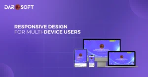
As users shift between devices throughout their day, from desktop browsers to mobile apps to smartwatches, they expect one thing to remain constant: your brand’s experience. This is where cross-platform UI consistency becomes crucial not just for aesthetics, but for building trust and familiarity across every touchpoint.
Why Platform Consistency Matters
“If I learn how to use your app on one device, I shouldn’t have to relearn it somewhere else.”
When your digital product looks, behaves, and feels consistent regardless of where it’s accessed, users are more likely to trust it, engage with it, and stay loyal.
Elements to Standardise Across Platforms
UI Element | Consistency Benefit |
Navigation structure | Users don’t have to relearn where to find things. |
Iconography and visual style | Builds immediate brand recognition. |
Tone and microcopy | Reinforces personality and emotional trust. |
User flows (e.g., checkout, onboarding) | Supports intuitive task completion across devices. |
Colour schemes and typography | Ensures visual cohesion and familiarity. |
Omnichannel Trust: Beyond Devices
Cross-platform consistency isn’t just about switching between your desktop and mobile app. It’s about creating omnichannel trust across all digital and physical touchpoints:
A chatbot on your website should speak the same tone as your in-app assistant.
An email confirmation should visually and linguistically match your product interface.
A kiosk or embedded display should offer the same affordances and feedback as your mobile experience.
Inconsistency = Doubt
If a user logs into your app on their phone and finds a completely different layout than what they used on their desktop, even subtle shifts can cause cognitive friction:
“Am I in the right place?”
“Is this the same company?”
“Why does this feel harder here?”
This friction creates hesitation, which weakens trust and may cost you a conversion, signup, or renewal.
Best Practices for Platform Consistency
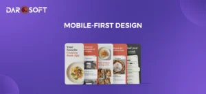
Use a design system like Material UI, Apple HIG, or a custom component library.
Design mobile-first, then expand to web and other platforms while maintaining core UX logic.
Audit user flows across all platforms regularly to ensure parity.
Test cross-device scenarios, including login, purchases, and notifications.

Common Pitfalls
Pitfall | What It Looks Like | Why It Breaks Trust | Fix It |
Random Layout Shifts | Content jumps due to late-loading images, dynamic ads, or injected elements. | Feels unstable and unpredictable; users lose control and may mis-click. | Use placeholders, skeleton loaders, and set min-height to stabilise the layout during loading. |
Inconsistent Iconography | Different icons for the same function or mixed visual styles (outline vs. filled). | Breaks visual recognition; users hesitate because cues aren’t intuitive or reliable. | Standardise icon usage with a single icon library and design guidelines. |
Mixed Tone and Wording | Switching between formal/casual tone, inconsistent button copy (e.g., “Submit” vs. “Apply”), and unclear error messages. | Feels unprofessional and disjointed; creating friction and emotional distance. | Create and follow a UX writing style guide aligned with brand voice. |
Visual Hierarchy Inconsistencies | No clear priority in layout, inconsistent heading sizes, equal-looking buttons, and poor contrast between sections. | Overwhelms users, confuses, and slows navigation or decision-making. | Use consistent typography, spacing, and layout grids; emphasise important actions with contrast. |
The Backbone of Scalable Trust
As digital products scale across platforms, teams, and customer touch-points, maintaining trust through consistent, reliable interfaces becomes increasingly complex. This is where design systems play a critical role. A design system is more than just a style guide; it’s a comprehensive framework of reusable UI components, design patterns, and interaction guidelines that enable teams to build cohesive experiences faster and more reliably.
How Design Systems Reinforce Trust
Aspect | Impact on Trust | Explanation |
Consistency at Scale | Ensures users have a familiar experience across all products and platforms. | Components like buttons, input fields, and modals behave and look the same, reducing friction and increasing user confidence. |
Efficiency for Teams | Reduces UI guesswork and inconsistency across designers and developers. | Teams use a shared language and components, decreasing the risk of design divergence that might confuse or frustrate users. |
Faster, More Reliable Iteration | Updates and improvements roll out uniformly. | When one component is improved (e.g., accessibility of a button), it updates everywhere it’s used—benefiting every user and team at once. |
Governance and Quality Control | Enforces accessibility, brand guidelines, and UX standards by default. | Design systems often include accessibility rules, interaction patterns, and tone guidance that uphold usability and brand trustworthiness. |
Cross-Platform Coherence | Creates a unified visual and interaction model across the web, mobile, and more. | Users navigating between platforms feel at home, which increases brand credibility and usability. |
FAQs
Why does UI consistency matter so much for user trust?
Consistency helps users form expectations. When visual elements, interactions, and behaviour remain predictable, users feel more confident and in control two key components of trust. Inconsistency introduces doubt and cognitive friction.
What elements should be kept consistent in UI design?
Core areas include:
Visual design: colour, typography, spacing, iconography
Functional design: button behaviour, form logic, navigation
Interaction design: transitions, scroll behaviour, feedback animations
Tone and messaging: language, microcopy, CTAs
Can over-consistency make a UI feel boring?
Consistency doesn’t mean monotony. A well-designed interface can maintain consistency while using visual hierarchy, tone, and layout variation to guide and engage users. The goal is intuitive familiarity, not repetition for its own sake.
What’s the difference between a style guide and a design system?
Style Guide = Visual brand elements like fonts, colours, and logos.
Design System = A broader framework that includes reusable components, interaction rules, accessibility standards, and usage guidelines supporting both design and development.
How do design systems support trust at scale?
Design systems ensure that no matter which team or platform is involved, the product feels cohesive. This eliminates accidental inconsistencies and promotes unified, high-quality experiences across web, mobile, and even physical products.
What tools can help maintain UI consistency?
Some popular tools include:
Figma or Adobe XD: for component libraries and shared styles
Storybook: for front-end component documentation and testing
Design tokens: to sync design specs with code across platforms
Zeroheight: to create a living design system documentation
What are the signs that a product is suffering from poor UI consistency?
Mixed icon styles or colours
Unpredictable button placements or actions
Disjointed tone of voice
Layouts that shift randomly across screens or devices
Inconsistent use of feedback animations or transitions
Trust Is Built Pixel by Pixel
Consistency in UI design is more than a stylistic choice, it’s a fundamental pillar of user trust. From predictable interactions to aligned visual elements and seamless cross-platform experiences, every detail signals to users that your product is reliable, thoughtful, and professional.